 Verify SmartCanvas
Installation & Activation
Verify SmartCanvas
Installation & ActivationSmartCanvas is a Web-based (HTML5) product design tool that enables administrators within MarketDirect StoreFront to create templates for a variety of products such as greeting cards, flyers, business cards, brochures, stationery, and banners. SmartCanvas is a product type in MarketDirect StoreFront.
Buyers can use the product design tools to personalize products by selecting images from galleries and adding their own text, images, QR codes, and shapes.
You can use SmartCanvas to create Super Wide Format jobs such a large banners that can be printed on print engines such as ePS VUTEk.

 Verify SmartCanvas
Installation & Activation
Verify SmartCanvas
Installation & ActivationIf you are
an ePS-hosted (cloud) customer: All hosted customers will get
access to a hosted SmartCanvas server in the production environment.
You do not have to do any configuration. Thus, this section applies
to self-hosted sites only.
If you are a self-hosted customer: Ensure that you have installed
SmartCanvas and set up the server following the instructions in the
document MarketDirect StoreFront
- SmartCanvas Installation Guide before proceeding to step 3.
Important: The SmartCanvas Server component cannot be installed on the same server as MarketDirect StoreFront.
Please note that this step is for self-hosted (standalone) installations only.
1 Go to Administration > License.
2 Scroll down to the PRODUCT OPTIONS section and verify that the SmartCanvas option is selected.
If the SmartCanvas option is not selected, please contact your ePS sales representative, call (412)-785-1699, or fill in the Web form at https://epssw.com/contact-us.php for more information on obtaining a license for SmartCanvas.

 Step
2: Open the Manage SmartCanvas Templates Page
Step
2: Open the Manage SmartCanvas Templates Page● Go to Administration > Manage SmartCanvas Templates.
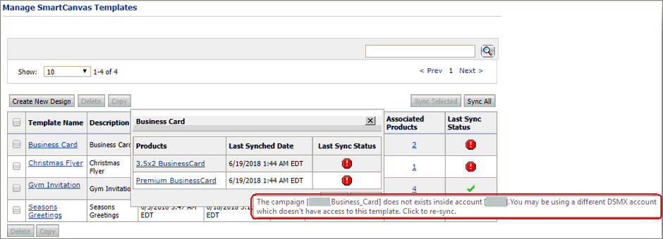
The Manage SmartCanvas Templates page is where you can create, delete, copy, secure, and synchronize SmartCanvas templates as well as access any existing template in your system.
● Create New Design: Opens SmartCanvas so you can begin creating a new design template.
● Delete: Deletes the selected template(s).
● Copy: Lets you copy a selected template.
You do not have to create each template from scratch (Create New Design). You can copy an existing template and modify it as needed to suit the new design. See Create a SmartCanvas Design Template Based On an Existing Template later in this help topic for more information.
● Sync Selected: Synchronizes the selected products associated with the SmartCanvas template.
For example, if you make a change to one or more form fields in the template (e.g., a form field is added or modified), synchronizing will update the field in selected products associated with the template.
Synchronizing affects the following form
fields in SmartCanvas templates:
· Display
Name
· Default
Value
· Is
Required
· User
Profile Field and its Default values
· Common
Data and its Default values
· Address
Book Field and its Default values
● Template Name: Lists the name of the SmartCanvas template as a link that you can click to open the template for viewing and editing.
● Description: The description of the template you provided when creating the template.
● Created On: Displays the date on which you created the template.
● Last Modified: Displays the date on which the template was last edited.
● Security: Lets you specify security settings for the template.
● Manage Template Settings: Lets you specify global settings for the template.
● Associated Products: Displays the number of SmartCanvas Products currently associated with the template. Clicking on this link opens the Associated Products window that lists all the products linked to the template along with the status of the last synchronization performed. Clicking on the product link navigates to the “manage product” page of the product.
● Click the number to open a window that lists all associated products.

● Click the product name link to open the product in the Manage Product page.
● Click Sync All to synchronize all products associated with the SmartCanvas template.
When you synchronize products associated with SmartCanvas templates, the changes you have made to the template (e.g., a change to a web form field associated with an address book field) will be applied across all products associated with the template.
● Last Sync Status: Indicates whether the product is currently synchronized with the SmartCanvas template.
● Whenever the form fields on a template associated with a product are updated in the SmartCanvas editor, MarketDirect StoreFront will try to sync the form field changes to all the associated products using the SmartCanvas template. This happens automatically after the SmartCanvas editor window is closed.

● In the event of any failure in synchronizing the changes, MarketDirect StoreFront will display an error icon in the Last Sync Status column of the corresponding template. In this case you can:
● Click on the error icon to re-sync the changes manually for all the products associated with the template.
● Click on the number link in the Associated Products column to open the dialog showing all the products linked to the template where the error occurred and view the sync error message for individual products by hovering the mouse over the error icon across the respective products.

 Step
3: Create a SmartCanvas Design Template
Step
3: Create a SmartCanvas Design TemplateTo base a new template on an existing SmartCanvas
template, select the template you want to base the new template on
from the list of templates on the Manage SmartCanvas Templates page
and then click Copy. For more
information, see Create
a SmartCanvas Design Template Based on an Existing Template later
in this topic.
Changes made to the design template will be applied immediately to
all products associated with the template on the storefront
(i.e., without requiring you to go to the Products
page and republish products associated with the template).
1 Go to Administration > Manage SmartCanvas Templates.
2 On the Manage SmartCanvas Templates page, click Create New Design.
3 In the Create Template window, define the template:
● Template Details:
● Template Name: (Required) Enter a name for the template.
● Description: Enter a brief description of the template that will be shown in the Description column on the Manage SmartCanvas Templates page.
● Preferences:
● Allow buyer to download PDF: Select this check box to let buyers download a PDF file.
● Select Gallery: To make one or more
of your existing MarketDirect StoreFront
image galleries available for buyers to use when creating products
based on the template, select the gallery from the list on the left
and click  . To remove a selected gallery, select
it from the list on the right and click
  .
.
Adding theses image galleries
to the template will make the contents available to the administrator
when designing the template and to buyers when personalizing products
based on the template. These image galleries will be "live"
so that as MarketDirect StoreFront
image galleries are modified (i.e., as images are added, deleted,
and renamed), they will be updated into the SmartCanvas gallery as
well.
To select multiple galleries, press Shift and hold while clicking the
galleries you want to select.
● Click Create Template.
The SmartCanvas template designer will open.
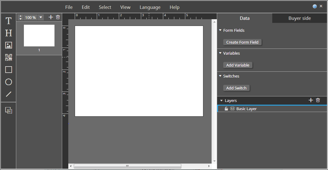
To proceed directly to the steps to design the product template in the SmartCanvas designer, go to Step 3: Design the SmartCanvas Design Template. To learn more about the SmartCanvas designer, go to Introduction to the SmartCanvas Interface.
The SmartCanvas designer:
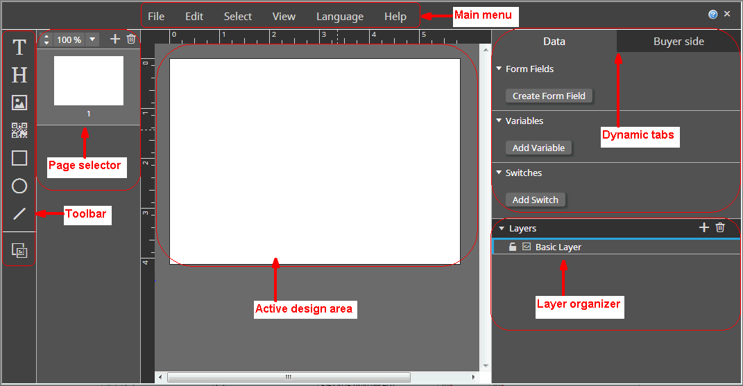
The table below is a guide to the main menu of the SmartCanvas template designer:
The main menu
 |
|||||||||
Menu |
Options and functions |
||||||||
File |
This menu has some global settings for the design template. ● Open: Opens a saved version of the design template. ● Current document without changes: Lets you revert to the last saved version of the design template. This will abandon all changes you made since the last time you saved the design template. ● Old
version: Lets you open
any previous saved version of the design template. ● Save: Saves the template. Shortcut: CTRL+S. Although templates are "auto-saved" after every change, the auto-save is only for undo workflows on the administration side. The changes you make to a design template will not be applied to an associated product on the storefront until you do a manual File > Save. If the template on the storefront (buyer side) is not consistent with the same template on the administration side, it may be because changes have not been officially saved with File > Save. ● Document settings: Lets you define global settings for the design template, including the dimensions of the design template, the page margins, and the bleed preview width (if the design includes bleeds that extend the print to the edge of one more sides and will be trimmed after printing). The fields in the Document Settings window are covered in the A. Specify document settings for the template section. ● Create preview PDF: Generates a PDF version of the design template for review purposes. Shortcut: CTRL+P. ● Create print PDF: Generates a PDF version of the design template for print production purposes. ● Manage fonts: Lets you add and manage fonts for use in the design template. ● Manage impositions: Lets you manage how pages in the template are imposed (laid out for printing). ● Exit: Closes the design template without saving the changes you have made since the last time you saved the template. |
||||||||
Edit |
This menu lets you manage undoing and redoing previous actions. ● Undo: Abandons the last action performed. CTRL+Z. ● Redo: Performs the last undo action. CTRL+Y. |
||||||||
Select |
This menu let you select various elements on the design and specify what changes buyers can make to elements on the design when they are customizing products based on the design template. ● Select elements of the design: ● All frames ● All text frames ● All images ● All QR codes ● All rectangles ● All ellipses ● All lines ● Buyer Side: Opens the Buyer Side window where you can specify global settings that control what adjustments buyers can make to the elements (text, images, QR codes, rectangles, ellipses, and lines) of the design template You can choose settings in the Buyer side tab when an element of any type is selected to override that global settings (defined in this Buyer Side window) for the selected element.
● General Settings: ● Move: Lets buyers reposition elements of this type on the design. ● Remove: Lets buyers remove elements of this type from the design. ● Resize: Lets buyers resize elements of this type. ● Keep Ratio: Locks the aspect ratio of elements of this type so buyers cannot change it. ● Rotate: Lets buyers rotate elements of this type. ● Background color: Lets buyers change the background color of elements of this type. ● Border: ● Border Color: Lets buyers change the border color of elements of this type. ● Border Thickness: Lets buyers change the border thickness of elements of this type. ● Corner Radius: Lets buyers change the corner radius of elements of this type. ● Width: ● Min: Sets the minimum width of elements of this type. ● Max: Sets the maximum width of elements of this type. ● Height: ● Min: Sets the minimum height of elements of this type. ● Max: Sets the maximum height of elements of this type. ● Image: ● Change Image: Lets buyers replace the image with an image they upload or select from a gallery. ● Text: ● Edit Text: Lets buyers change the text in elements of this type. ● Styles (for text elements only): Lets buyers apply the selected text styles to elements of this type. ● Colors: Lets buyer change the color of elements of this type (select all colors available to buyers). |
||||||||
View |
This menu lets you specify how specified elements of the SmartCanvas designer are shown and toggle between the administrator view and the buyer view. ● Page thumbnails: Shows the page thumbnail pane on the left side of the designer.
● Context panel: Shows the context panel that has dynamic tabs based on elements selected on the design.
● Document margin: Shows the margin guidelines.
● Ruler: Shows the vertical and horizontal rulers.
● Buyer Side: Opens the buyer side view of the template designer (i.e., how the designer will appear to buyers configuring products based on the design template). You can design the template in either view. Administrator
view of the template designer: ● The
create preview PDF icon ● To close the buyer side view
and return to the administrator view, click ● Unit: Specifies the unit of measurement to use in the designer (i.e., indicated on the ruler). ● Point ● Pica ● Inch ● Cicero ● Millimeter ● Centimeter ● Meter ● DocML: Open a window that displays read-only XML source code of the current SmartCanvas template. This option is a useful support tool for troubleshooting purposes. |
||||||||
Language |
● Select the localized version of the SmartCanvas designer that you want to use. |
||||||||
Help |
● About SmartCanvas: Displays the SmartCanvas version and release date. ● Click OK. |
||||||||
| Context Panel | |||||||||
| The context panel is where dynamic tabs (e.g., Text, Layout,
Buyer side, Data) are shown corresponding to the selected
element.
|
|||||||||
| Layers Manager | Working with layers
To add a layer ● Click
● Double-click the "New Layer" name and type a name for the layer.
To duplicate a layer ● Select the layer. ● Click
To delete a layer ● Select the layer. ● Click
To lock a layer ● Select the layer. ● Click
To rearrange the order of layers ● Select the layer. ● Click and drag the layer up (to position it on top of all layers below it) or down (to position it beneath all layers above it) as needed. To specify layer global layer visibility options ● Select the layer. ● Click
● Show always: Makes the layer always visible. ● Show never: Makes the layer never visible. To specify layer visibility options for preview and print for the Basic Layer ● Select the layer. ● Click
● Layer appears in print and preview: The typical case in which you will print exactly what the buyer sees when ordering a product on the storefront. ● Layer appears only in preview: A use case in which the preview will differ from the production PDF. You can use this for adding watermarks to previews.
You could also use this combination
to add a placeholder for the static elements of a pre-printed
or pre-defined PDF for stationery such as a business card
with a company logo and address. This lets the buyer see what
the finished product will look like. The generated PDF, however,
will contain only the buyer-entered variable data to be merged
with or printed on the static background.
● Layer appears only in print: You could select this if you wanted to include job information, densitometer and color calibration bars, crop and registration marks, and bleed margins to your designs. Buyers will not see them, but the operator who produces the job will. Images included on the template even on a layer that is not displayed in the buyer preview (i.e., print-only) will be visible in the gallery. Thus, if you create a layer and put print-only elements such as bleed marks or slugs (as images) those will be included in the gallery. |
||||||||
The table below is a guide to the SmartCanvas template designer toolbar:
| The left navigation bar | |
Icon |
Function |
|
Adds text to the design template. |
|
Adds headline text to the design template. |
|
Adds an image to the design template. |
|
Adds a QR code to the design template. |
|
Adds a rectangle to the design template. |
|
Adds an ellipse to the design template. |
|
Adds a line to the design template. |
|
Show/hide bleed margins in the design window. Hiding the bleed areas will let you preview how the finished product will look. |
 |
Zooms to the selected percentage. |
|
Adds a page to the design template. |
|
Deletes the selected page from the design template. You can delete an individual page only when the Facing pages option is not selected in the Document Settings. For more information see A. Specify document settings for the design template in this help topic. Otherwise, you will only be able to delete both facing pages. |

 A.
SmartCanvas Plugin for Adobe InDesign
A.
SmartCanvas Plugin for Adobe InDesignThe ePS SmartCanvas Plugin for Adobe InDesign allows you to export files created using InDesign, and then import those files into SmartCanvas, where you can edit the sections of the file designated as Variables. Image boxes and Text boxes can be marked as Variables, whereas are all other sections are marked as Static by default. Static sections cannot be edited in SmartCanvas.
To install the plugin on Windows:
1 Open the MarketDirect Cross Media and VDP Resources page:
● https://epssw.com/print/marketdirect-cross-media-and-vdp-resources/
2 Select the MarketDirect SmartCanvas tab.
3 Click the Installer link for the ePS SmartCanvas Adobe InDesign Plugin Windows to download the executable file.
If you are updating the ePS SmartCanvas Adobe InDesign Plugin Windows, you must manually uninstall the application before proceeding to step 4.
4 Run the EPS SmartCanvas Plugin for Adobe InDesign.exe.
Make sure to close InDesign before running the executable file.
5 Follow the prompts in the EPS SmartCanvas Plugin for Adobe InDesign window.
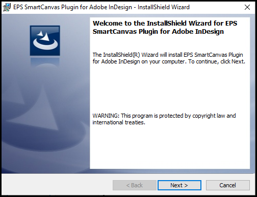
6 Open InDesign and you will see the EPS SmartCanvas option in the menu bar.

If you do not see the EPS SmartCanvas option, then restart InDesign.
To install the plugin on Mac OS:
1 Open the MarketDirect Cross Media and VDP Resources page:
● https://epssw.com/print/marketdirect-cross-media-and-vdp-resources/
2 Select the MarketDirect SmartCanvas tab.
3 Click the Bundle link for the ePS SmartCanvas Adobe InDesign Plugin Mac to download the zip file.
4 Unzip the EPS SmartCanvas Plugin for Adobe InDesign file.
5 Open the Scripts Panel folder in the EPS SmartCanvas Plugin for Adobe InDesign folder.
6 Copy the EFI folder.
7 Paste the EFI folder in Applications > Adobe InDesign 2020 (or higher) > Scripts > Scripts Panel.

The EPS SmartCanvas Plugin for Adobe InDesign is only available for InDesign 2020 or higher.
8 Open the startup scripts folder in the EPS SmartCanvas Plugin for Adobe InDesign folder.
9 Copy the EFI folder.
10 Paste the EFI folder in Applications > Adobe InDesign 2020 (or higher) > Scripts > startup scripts.

11 Open InDesign and you will see the EPS SmartCanvas option in the menu bar.

If you do not see the EPS SmartCanvas option, then restart InDesign.
To export a file from Adobe InDesign:
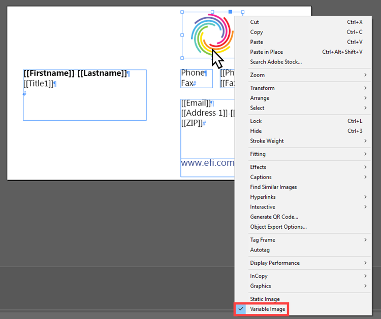
1 Designate Image boxes you want to edit in SmartCanvas as Variables.
● Right-click on the appropriate Image box in the Adobe InDesign file.
● Select the Variable Image option.
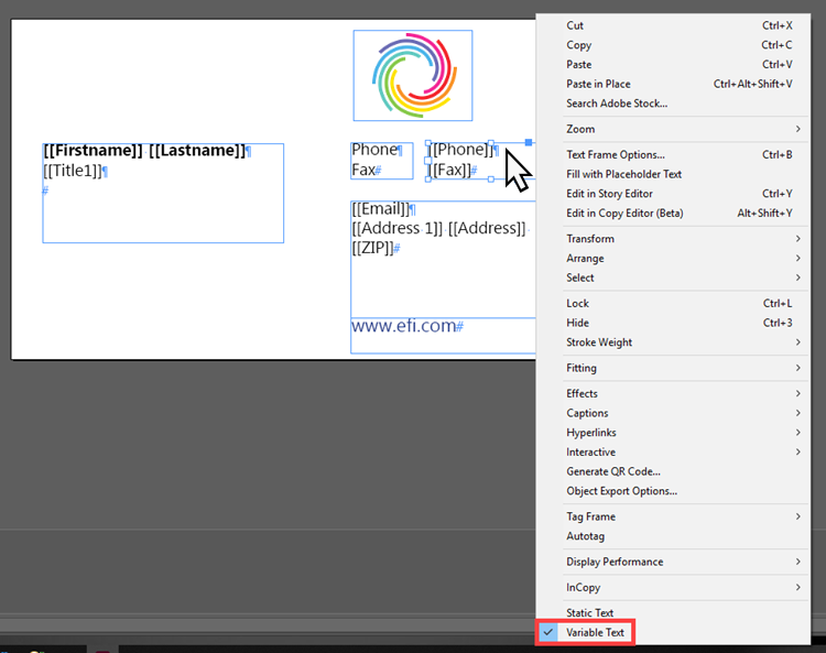
2 Designate Text boxes you want to edit in SmartCanvas as Variables.
● Right-click on the appropriate Text box in the Adobe InDesign file.
● Select the Variable Text option.
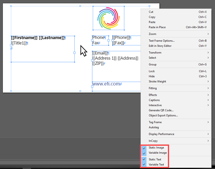
You can simultaneously designate multiple Image and
/ or Text boxes as the same option (Static or Variable
Image or Text).
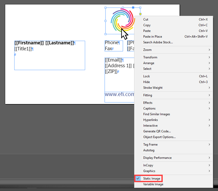
If you do not want to edit an Image
box or Text
box, you can designate them
as Static. All
boxes not given a designation will become Static
by default.
3 Select the EPS SmartCanvas option in the Menu bar.
4 Click Export.

5 Enter a name for your file in the Export window.
6 Click Save.
The InDesign file will export as a zip file.
To import an InDesign file into SmartCanvas:
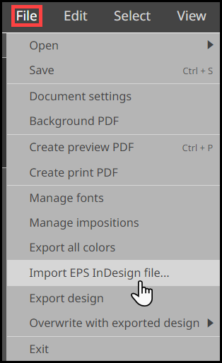
1 Select the File option in the Menu bar.
2 Click Import EPS InDesign file.
3 Click Import EPS InDesign file in the Import EPS InDesign file window.
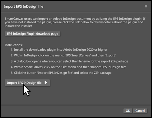
4 Choose the appropriate zip file to open the exported InDesign document in SmartCanvas.
Supported Properties:
The following is a series of drop-down lists containing all of the properties which SmartCanvas supports for export from InDesign.
Page width and height
Unit of measurement
Number of pages
Facing pages
Bleed
Margin
Layer:
Name
Color
Lock state
Respects custom zero point:
X and Y values are converted
Fonts
Color swatches
Paragraph styles
● 
 Variable Image and
Variable Text box shared properties
X and Y positions
Rotation
Width and height
Border:
Width
Color
Corner radius
Drop shadow:
Color
Offset
Blur
Blend mode
Opacity
Background color
● 
 Variable Image only properties
Embedded and linked images
Aspect ratio
Paddings
Image name
● 
 Variable Text box only properties
Text color
Font
Font size
Line height
Used paragraph style
Vertical alignment
Horizontal alignment
● 
 Paragraph Text Style properties
Name
Based on (paragraph)
Font
Font size
Text color
Line height
Horizontal text alignment
Bullet list
Indentation

 A.
Specify document settings for the design template
A.
Specify document settings for the design templateIt is a good idea to save your design template
often as you are working. To do so, select File
> Save (or CTRL+S).
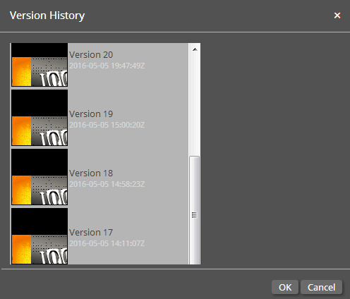
Each time you save your design template, a back-up copy of that version
of the template will be saved. You can return to any saved version
of the template by selecting File
> Open > Old version and selecting the version from the
list.
Note:
Although templates
are "auto-saved" after every change, the auto-save is only
for undo workflows on the administration side. To have any changes
you make to design template active in an associated product on the
storefront, you must do a manual File
> Save. Note also that if the template on the storefront
(buyer side) is not consistent with the same template on the administration
side, it may be because changes have not been officially saved with
File > Save.
1 In the SmartCanvas designer, select File > Document Properties.
2 In the Document Settings window, specify settings for the template:
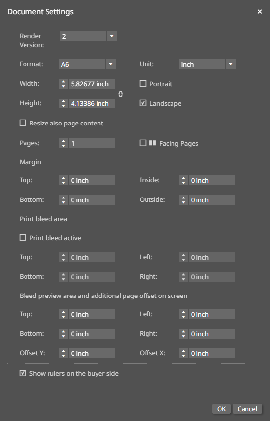
● Render Version: Certain fonts in a small text size produced uneven line spacing between the second to last and last line in a text box. This setting allows you to either select the original Render Version 2, or the latest Render Version 3, which produces even line spacing between the second to last and last line of text.
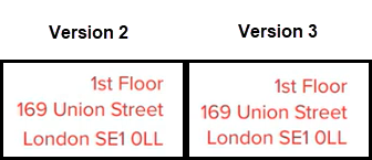
Existing SmartCanvas templates will continue to have Render Version 2 by default, whereas new SmartCanvas templates will have Render Version 3 by default.
● Format: If you want to use a predefined template size, select the size from the list.
If you select a predefined size, the Width and Height fields will be filled automatically.
● Unit: Specify the standard unit of measurement for displaying the format dimensions, margins, etc.
● Width: If you do not want to use one of the predefined template sizes, specify a width for the template.
● Height: If you do not want to use one of the predefined template sizes, specify a height for the template.
● Portrait: Specifies orientation as width by height (i.e., width greater than height).
To  locks the aspect ratio
between the width and height values.
● Landscape: Specifies orientation as height by width (i.e., height greater than width).
● Resize also page elements: Select if you want not only the page area but elements on the page (e.g., images and text) to be resized when buyers resize the template.
● Pages: Specify the number of pages in the template.
● Facing Pages: Displays interior pages in a multi-page template facing each other (side by side) in the design area to facilitate page layout.
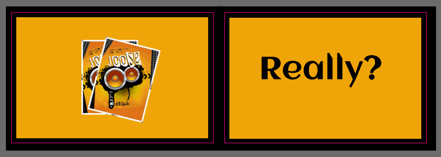
● Margin
● Top: Specify the top margin for the page.
● Bottom: Specify the bottom margin for the page.
● Inside: Specify the inside margin,
which is the space between where two facing pages meet in the middle.
See on
the image.
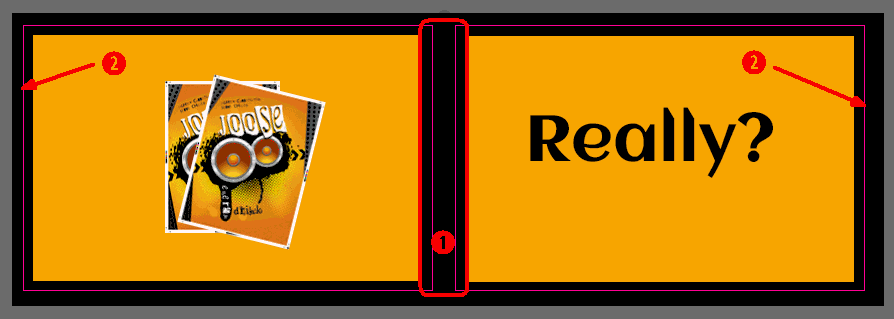
● Outside: Specify the outside margin
for the right and left pages. See on
the image.
● Print bleed area
A bleed is the overlap area around the edges of a page that is to be printed edge to edge (i.e., when printing will extend to one or more sides of the page). The image or background will thus extend beyond the page edge by a specified amount to ensure that there will be no white space at a bleed edge in the event that a page shifts during the print production process.
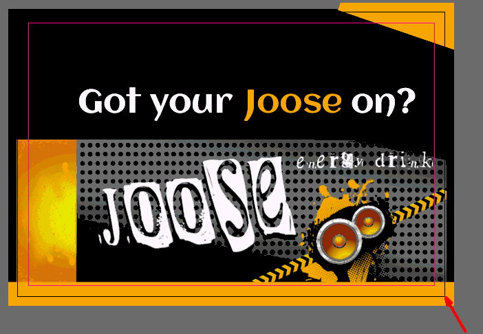
● Print Bleed Active: If your template has bleeds (images and other elements that extend to the edge of one or more sides) and does not use page imposition: (1) select this option to turn on bleeds in the production PDF file, then (2) specify bleed margin values in the fields below.
If the Print Bleed Active option is not selected and/or no bleed margin values are specified, the production PDF will have no bleeds.
If a default print imposition is enabled for the template, the bleed values specified in the Imposition Manager will be used not the values set in the Document Settings.
● Top: Specify the top bleed area for the template.
● Bottom: Specify the bottom bleed area for the template.
● Left: Specify the top bleed area for the template.
● Right: Specify the top bleed area for the template.
● Bleed preview area and additional page offset on screen
● Top: Specify the top bleed area for the preview.
● Bottom: Specify the bottom bleed area for the preview.
● Left: Specify the top bleed area for the preview.
● Right: Specify the top bleed area for the preview.
● Offset Y: Specify the bleed area for the y-axis (the top and bottom).
● Offset X: Specify the bleed area for the x-axis (the sides).
● Show rulers on the buyer side: Select if you want to show rulers on the template for the buyer preview.
3 Click OK.
To manage fonts used in the template:
1 Select File > Manage fonts.
2 Click Add.
3 On the Open window, navigate to the folder that contains the fonts you want to import.
To select multiple fonts, press Shift and hold while clicking the fonts you want to import. You can add TrueType and OpenType fonts.
4 On the window that informs your that import has finished, click OK.
5 To view details on a font: Select the font in the list to view the font displayed in sample text and the name, family, style, etc.
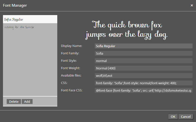
● Click OK.
● To delete a font: Select the font in the list and click Delete.
To manage the way pages in the template are imposed
1 Select File > Manage impositions.
Imposition is how pages are arranged on a sheet for printing (e.g., in signatures).
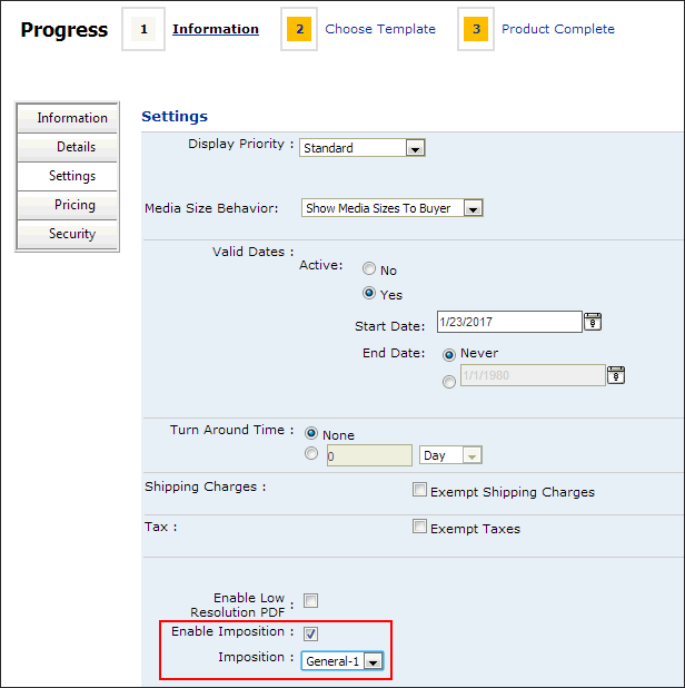
After defining impositions for the template,
when you are creating the product in MarketDirect StoreFront,
on the Product Settings page be sure to select Enable
Imposition and select the imposition you want to use as the
default for the product. Otherwise the product will be imposed as
a 1-up PDF file in the Job Ticket.
2 Select
an imposition to use an existing imposition.
OR
2 Click Create to define a new imposition.
● Display Name: Enter a name for the imposition.
● Description: Enter a brief description of the imposition.
● Click Create.
● Define the imposition:
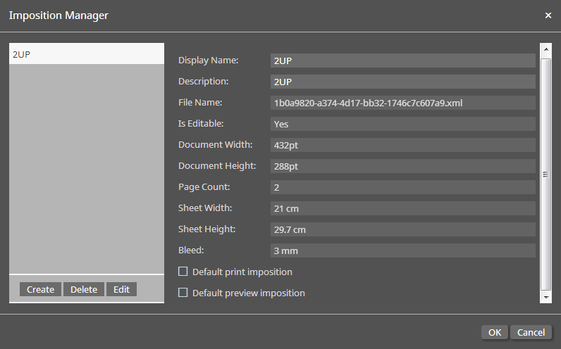
● Display Name: Change the name as needed.
● Description: Change the description as needed.
● File Name: The name of the XML file that defines the imposition.
● Is Editable: Specifies whether buyers can change the style.
● Document Width: Width of the document to be imposed.
● Document Height: Height of the document to be imposed.
● Page Count: The number of pages in the template.
● Sheet Width: The width of the sheet on which the imposed pages are printed.
Warning: If Sheet Width and Sheet Height are not specified, the generated PDF may be corrupt or a "Waiting for PDF generation" message may persist on the Production Job Ticket.
● Sheet Height: The height of the sheet on which the imposed pages are printed.
● Bleed: The bleed margin.
● Default print imposition: Designates the current imposition as the default print imposition for design templates.
● Default preview imposition: Designates the current imposition as the default preview imposition for design templates.
● Click Edit to edit the imposition:
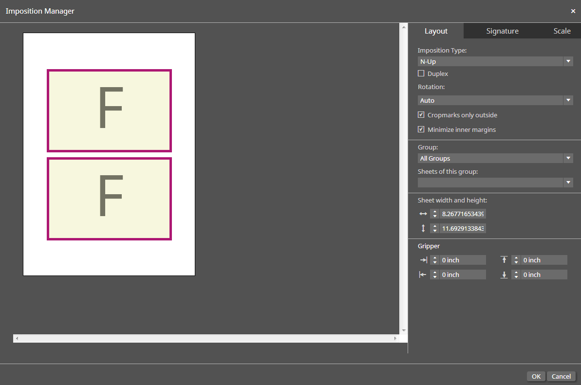
Layout Tab:
● Imposition Type: Specify the type of imposition to use for the design template.
● N-Up: Select if you want to define an n-up imposition.
N-up impositions print multiple pages per sheet (they can be the same page—as with step-and-repeat—or different pages). For example, 2-up will print 2 columns and 1 row per sheet side; 4-up will print 2 columns and 2 rows per sheet side; 8-up will print 4 columns and 2 rows per sheet side; etc.
● Brochure: Select if you want to define a brochure imposition.
Brochure imposition will print three pages up on each sheet for a tri-fold layout.
● Step & Repeat: Select if you want to define a step-and-repeat imposition.
Step-and-repeat impositions are used for printing multiple copies of the same page to fill a large sheet (typically with odd pages on the front and even pages on the back as with business cards).
● Duplex: Prints on both sides of the sheet.
● Rotation:
● Auto: Use the automatic rotation setting for the selected imposition.
● 0: No rotation.
● 90: Rotates pages 90 degrees.
● 180: Rotates pages 180 degrees.
● 270: Rotates pages 270 degrees.
· Crop marks only outside: Will print crop marks only on the outside of the sheet.
· Minimize inner margins: For N-up you can either leave a gutter between copies on the page or minimize them so that there is a shared edge (e.g., the outside edge of the bleed) between copies.
· Brochure Page Balancing:
These settings are for Brochure imposition type only.
● After last page: After the last page.
● Before last page: Before the last page.
● Last page -2 pages: Before the second to last page.
● Last page -3 pages: Before the third to last page.
● Use content of predecessor page: The inserted pages (1-3) will use the content of the page before the insert position.
● Content page get omitted: This will check the page count and allow a page to be deleted to make the page count match a brochure.
● Sheets of this group:
● Specifies the sheet on which the design template will be imposed.
● Sheet width and height:
Warning: If Sheet Width and Sheet Height are not specified, the generated PDF may be corrupt or a "Waiting for PDF generation" message may persist on the Production Job Ticket.
● Width: Enter a width for the sheet.
● Height: Enter a height for the sheet.
● Group: Sheet formats are grouped within different standards (e.g., European Standard, US Standards and Digital Printing Standards).
● Gripper: The gripper is the area on the sheet where the printing machine grabs the paper. You can define the size of the different gripper positions.
● Left
● Right
● Top
● Bottom
● Click OK.

 B.
Add and format text for the template
B.
Add and format text for the template1 Make sure the page you want to add text to is selected in the design window (click on the page).
2 Click the add text icon  on the left navigation
bar.
A text frame with the default text Enter
your text here. will open on the center of the page.
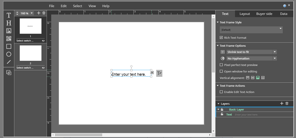
3 Select the text in the box and enter your text to replace it.
To add and edit text
1 Click
the add text icon  on the toolbar.
A new text frame will open in the design area.

You can also add headline text
to the template by clicking the add headline icon  on the toolbar. Both regular text and headline text are formatted
with the procedure covered in this section.
2 On the Text tab on the right side of the designer, define the text frame settings:
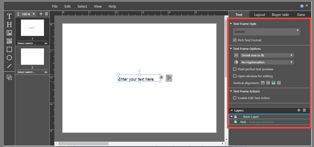
● Text Frame Style:
● Style list: Click the down arrow and make a choice:
● Select
an existing style, click OK,
and go to step 3 below.
OR
● Click the add icon to define a new text frame style.
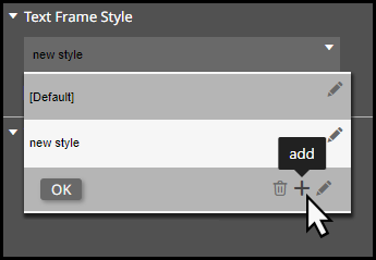
● Select the style you added (by default named new style or new style copy ...) from the style list and then click the edit icon to open the Text Style Manager.
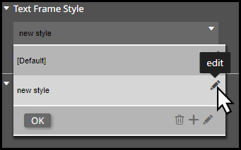
● Text Style Manager: Customize a new text style or edit an existing text style.
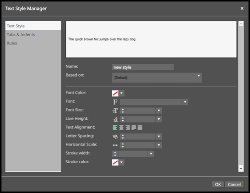
Text Styles are a great way to save a custom look and feel for your text, which you can use in any SmartCanvas template in the Text Editor window.
● The Text Style Manager contains three tabs:
● The Text Style tab allows you to define the look and feel of the text.
● Name: Enter the name of the new text style.
● Based on: Choose another text style to use as a template for the new style.
● Font Color: Choose the color of the font.
● Font: Choose the font for the text style.
● Font Size: Either manually enter or choose the size of the font.
● Line Height: Either manually enter or choose the height of the line box, which sets the distance between different lines of text.
● Text Alignment: Select the alignment of the text.
● Letter Spacing: Either manually enter or choose the amount of space between letters.
● Horizontal scale: Either manually enter or choose a percentage by which to expand or condense the letters.
● Stroke width: Either manually enter or choose the width of a border around each letter.
● Stroke color: Choose the color of the stroke border applied to each letter.
● The Tabs & Indents tab allows you to define default text indentions and alignments.
● Indent: Either manually enter or choose the left and right indention of each line of text.
● Start Indent Offset: Either manually enter or choose the indention of the first line in each block of text.
● Bullet List: Choose the bullet style icon.
● Scale indents if text is scaled: Enable to scale the indention of each line of text if the text is scaled to the container.
● Tab stop is the horizontal position
which is set for placing and aligning text on a page. Click
 in the Alignment/Position box to add tab stop alignment.
-Align On: Choose to align the tab stop on commas or periods.
-Alignment: Choose the kind of tab stop.
-Left: Text extends to the right from the tab stop.
-Right: Text extends to the left from the tab stop.
-Center: Text is centered at the tab stop.
-Decimal: Text before the decimal point extends to the left, and text after the decimal point extends to the right.
-Position: Either manually enter or select the position of the tab stop.
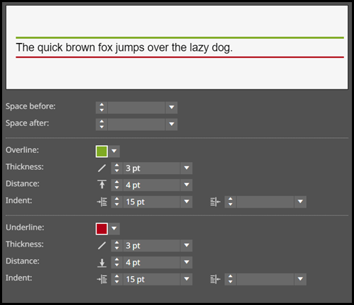
● The Rules tab allows you to define character spacing, as well as custom Overlines and Underlines.
● Space before: Either manually enter or choose the amount of space before each line of text.
● Space after: Either manually enter or choose the amount of space after each line of text.
● Overline: Choose the color of the text overline.
● Thickness: Either manually enter or choose the thickness of the overline.
● Distance: Either manually enter or choose the distance between the text and the overline.
● Indent: Either manually enter or choose the left and right indention of the overline.
● Underline: Choose the color of the text underline.
● Thickness: Either manually enter or choose the thickness of the underline.
● Distance: Either manually enter or choose the distance between the text and the underline.
● Indent: Either manually enter or choose the left and right indention of the underline.
Here is an
example of text Overline and Underline:
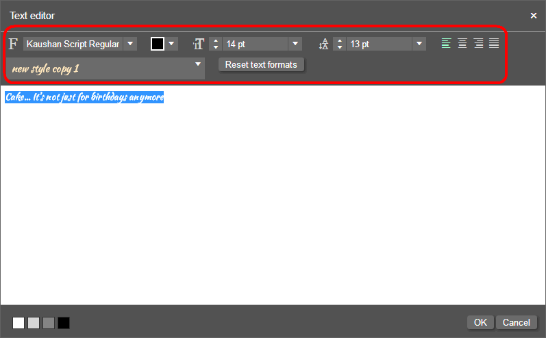
● Rich Text Format: This setting allows rich text formatting in the Text editor window if the Open window for editing option is selected in the Text Frame section:
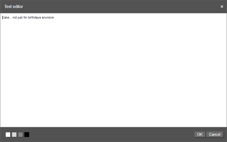
If the Rich Text Format option is not selected, the Text editor
will not have any rich text options:
To insert a tab when editing text in a text frame, simultaneously press \ (backspace) and t (lowercase letter t): \t
● Text Frame Options:
● Copy fitting: This setting specifies how text will be arranged within the text frame.
● No
copy fitting: The text will
not be automatically adjusted based on the size of the text frame.
For example, if the text is too large for the text frame, it will
be cut off.

● Shrink text to fit: Text that is too large to fit inside the frame will be scaled down to fit the frame.
● Shrink & Grow: Text will be scaled (made smaller or larger) to fit the size of the text frame.
● Shrink & Grow - no line wrap: Text will be scaled (made smaller or larger) to fit the size of the text frame but will not wrap to a second line (i.e., all text will be on one line).
● Hyphenation:
Hyphenation will be visible only when Pixel perfect text preview is selected.
● No hyphenation: Specifies no hyphenation for the text in the frame.
● Language-specific hyphenation: Select the language whose hyphenation rules you want to apply to the text.
● Pixel perfect text preview: Anti-aliases (smooths) the text to better approximate on screen how it will appear when printed.
● Pixel perfect text preview off:

● Pixel perfect text preview on:

● Open window for
editing: This option will cause
a rich text editor window to open when you and buyers click the text
format icon for the selected text frame.

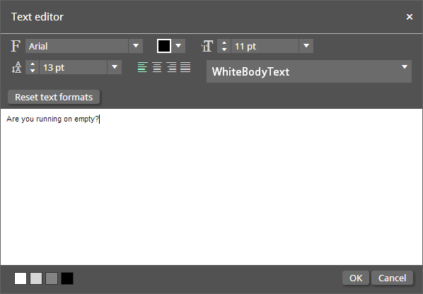
You can resize the text editor (e.g., so that it does not cover the part of the design area you are editing) by selecting any size of the text editor window and resizing it.
● Vertical alignment: Specifies how the text aligns vertically within the text frame (on the y-axis).
● Align up: Text will be aligned to the top of the text frame.
● Align center: Text will be centered vertically within the text frame.
● Align bottom: Text will be aligned to the bottom of the text frame.
● Justify: Text line spacing will be adjusted so that lines of text are spaced evenly with the first line at the top, the last line at the bottom, and the lines between distributed equally.
● Text Frame Actions:
● Enable Edit Text
Action: This options enables an
edit button  to be placed in the Personalization
column on the buyer side. The buyer
will be able to click the Edit Text Action button
in the Text Frames section
to open a Text Editor window for the field instead of having to click
on the field in the SmartCanvas image.
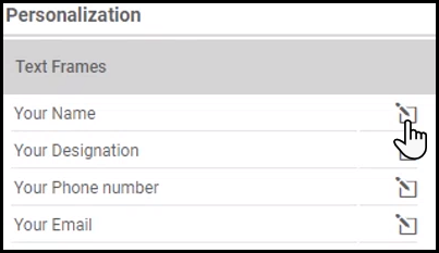
If
you click Enable Edit Text
Action a Display
Name field will appear.
Enter a field name to display to the buyer in the Text
Frames section.

3 To enter text, you have two options:
● Enter text directly in the text frame:
Position your cursor inside the text frame, select the sample text
(e.g., "Enter text here"), and enter your text directly
over it.
OR
● Enter and edit text on the rich text editor: (1) Select the Open window for editing check box in the Text Frame Options section on the right side of the designer. This will open a rich text editor window when you click the text format icon to the right of the selected text frame. (2) Edit the text in the text editor.
|
 |
4 Enter your text and then format following the steps in the following section.
To format the text in the frame:
1 Select the text frame by clicking on one of its borders.
2 Select the text in the frame that you want to format.
3 Click the text format icon to the right
of the text frame.

4 Format the text using the Paragraph Style and Character Style options in the Text area on the right side of the designer or (if the Open window for editing check box in the Text Frame Options section is selected) using the rich text options in the text editor window.
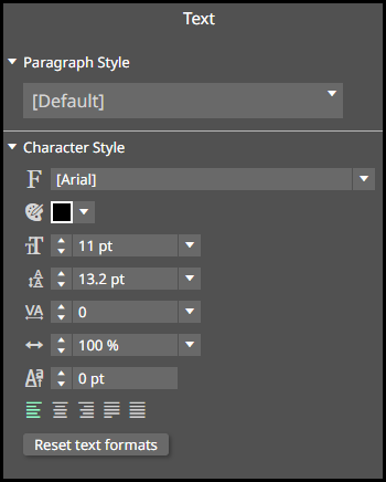
● Paragraph Style:
● Style list: Select a style from the drop-down list.
For the steps to create a new paragraph, see To define a new paragraph style.
● Character Style: You can format selected text if you want it to be different from the style that is applied to it.
The Character Style settings will only be available if the Rich Text Format option is selected in the Text Frame Style section.
● Font: If you want to override the default font setting of the style that is applied to the text, specify a font.
For
example, you can use this to use two (or more) different fonts in
the same text frame.

● Color: If you want to override the default color setting of the style that is applied to the text, specify a color.
● Size: If you want to override the default size setting of the style that is applied to the text, specify a size.
● Line Spacing: If you want to override the default line spacing setting of the style that is applied to the text, specify the space between each line of text.
● Letter Spacing: If you want to override the default text tracking setting of the style that is applied to the text, specify the space between each character in the text.
● Horizontal Scale: If you want to override the default horizontal scale that is applied to the text, specify a percentage by which to expand or condense the letters in the text.
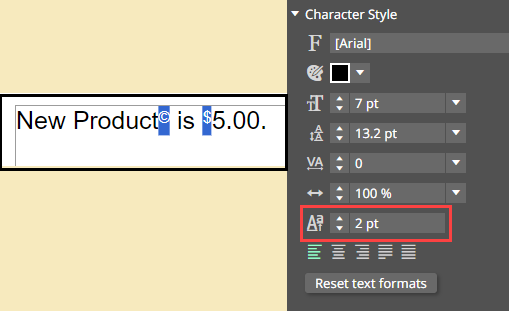
● Baseline Shift: If you want to override the default position of a character in the text, specify the placement of the character on the y-axis.
Baseline Shift
is helpful for symbols or icons like the dollar sign or copyright.
● Alignment: If you want to override the default text alignment setting of the style that is applied to the text, specify the alignment.
● Reset text formats: Click to reset the text formatting to conform to the specified style applied to the text.
This will undo any adjustments you have made to the text in the Paragraph Styles and Character Styles sections.
● Text editor: The font, color, size, line height, alignment, paragraph style, and Reset text formats fields all work the same as described above for the Paragraph Style and Character Style sections.
The rich text format settings
will only be available if the Rich
Text Format option is selected in the Text Frame Style section.

● Background color  :
This field controls the background color of the text area, which can
improve readability of text your are editing. Note that changing this
setting does not affect the text formatting in any way, only the readability.
For example, if you are reversing white text on a dark background in
your design, the white text will be invisible against the default
white text area on the text editor.
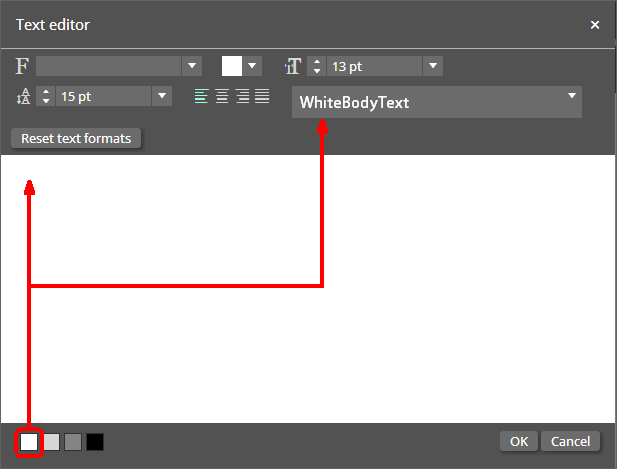
If you select the black background option, the white text will be visible.
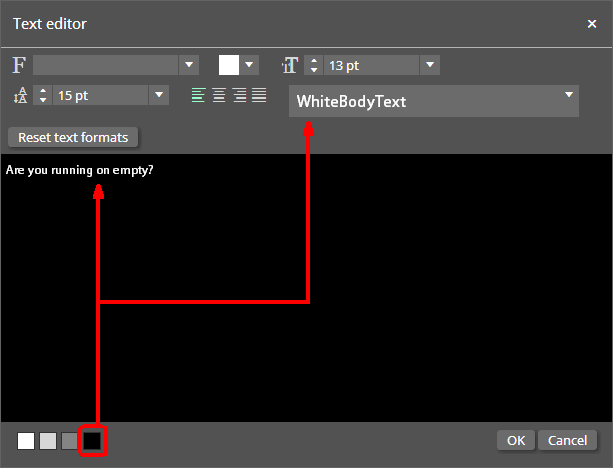
● Click OK when you are finished formatting the text, or click Cancel to abandon your changes and close the text editor.
To flow text between frames
You can connect two or more text frames so that text flows (overflows) from one frame to the next.
1 Create a second text frame to which you want to flow text.
2 Select the first text frame.
3 Click the text link icon  of the first text frame
and drag it onto the second text frame.
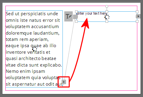
4 Click the text format icon to the right
of the first text frame and use the rich text editing tools in the
text editor to format the text.

All of the text is shown and can be formatted in the text editor.
● Layout tab settings: These settings are on the Layout tab on the Context Panel (at the left side of the designer window).
For information on defining Layout tab settings, see To specify the layout of an image or shape in this help topic.
To arrange, align, group, and distribute text objects on the page, see To arrange, group, align, and distribute objects in this help topic.

 C.
Add and format images
C.
Add and format imagesSmartCanvas supports the following image types: JPEG, JPG, PNG, GIF, BMP, TIFF, EPS, PSD, PDF 1.3-1.7.
To add an image
1 Click
the add image icon  .
.
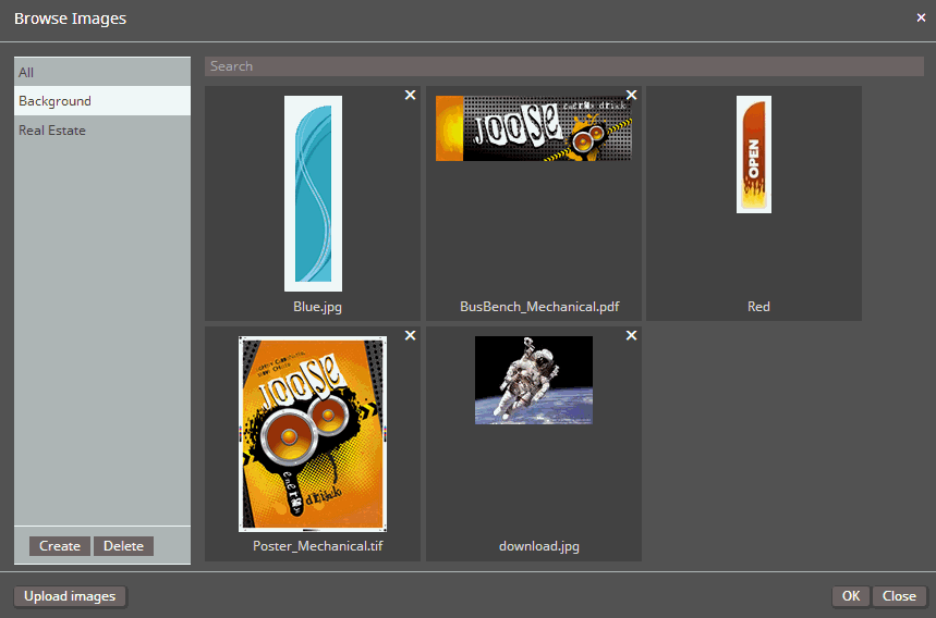
2 In the Browse Images window:
● To use an existing image, select a category or All (to see all available images in the gallery).
● To upload a new image, click Upload images.
● In the Open window, navigate to and select the image(s) to add.
You can select multiple images by selecting the images with the mouse while pressing and holding down the Shift key.
● Click Open.
● To create a new image category, click Create.
● Click on the new category name and enter a name for the category to replace the placeholder text ("Category").
● You can move images from any category to another category by selecting the image and dragging it onto the category name in the category list.
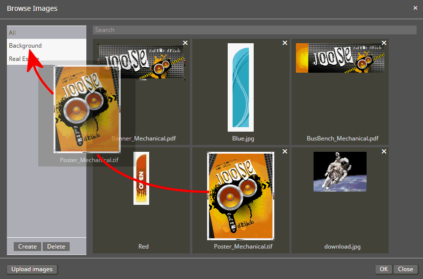
● To delete a category, select the category in the category list and click Delete. Click OK to confirm.
Deleting an image category will not delete the images in the category, only the category itself. Thus, if you create an image category and add images to it and then later delete that category, the images will still be available (e.g., in the All category). To delete an image, you must click the X in the upper right-hand corner of the image thumbnail.
● To delete an image, click the X in the upper right-hand corner of the image thumbnail.
You can only delete images that are not in use in a design template.
3 Click OK.
The selected image will be placed on the design.
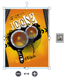
4 Reposition and resize the image as needed:
● Reposition the image:
● Select the image and click anywhere on the image.
● Drag it to the desired place on the design template.
● Resize the image:
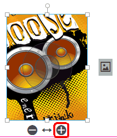
● Click
 to increase the size of the image within the image frame.
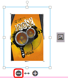
● Click
 to decrease the size of the image within the image frame.
| Original image | Enlarged image | Reduced image |
 |
 |
 |
To resize the image (preserving
the aspect ratio), click one of the corner handles and drag it to
the desired size. This works only when the Image
is completely visible option is selected in the Image
File : Fill field on the context panel (described in the following
section).
You can scale the box and the image will scale proportionally. The
image default is to scale proportionally. If you press and hold SHIFT it will override proportional
scaling.
To format an image
1 Select the image.
2 Format using the settings on the Image tab on the Context Panel (at the left side of the designer window).
● Data:
● Link to form field: Associates the image with a form field.
For information on form fields, variables, and switches, see Working with Data in design templates in this help topic.
● Image Fill:
You can also access these settings by right-clicking on the image frame and selecting Image Fill from the menu.
● Fill:
● Image is completely visible: The whole image is shown in the frame.
● Image fills frame: The image fills the entire frame.
This does not mean the image
is scaled so that the entire image fills the frame but that the image
as cropped will fill the entire frame.
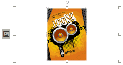
Here is an image that was cropped and is set to Image
fills frame:

Here is the same image that was cropped but is now set to Image
is completely visible:
● Position:
You can also access alignment settings by right-clicking the image frame and selecting Alignment from the menu.
● Automatic positioning: This option positions the image automatically in the image frame.
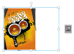
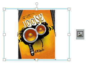
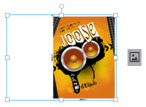
● Horizontal alignment: Specifies the horizontal alignment of the image within the image frame:
● Left
● Center
● Right
● Vertical alignment: Specifies the vertical alignment of a cropped image within the image frame:
● Middle
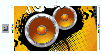
● Top
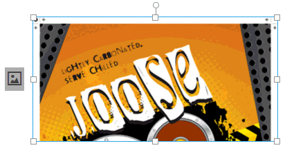
● Bottom
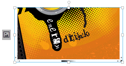
● Custom positioning: This option lets you position the image wherever you like within the image frame.
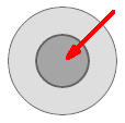
● Click
the light-gray outer band of the image selector or anywhere on the
image except the dark gray inner circle of the selector and then drag
to reposition the image frame.
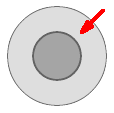
● Click
the dark-gray inner circle of the image selector and then drag to
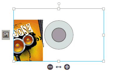
reposition the image within
the frame.
This allows you to conceal part of the image by moving it out of the
frame.
● Layout tab settings: These settings are on the Layout tab on the Context Panel (at the left side of the designer window).
For information on defining Layout tab settings. see To specify the layout of an image or shape in this help topic.
To arrange, align, group, and distribute objects on the page, see To arrange, group, align, and distribute objects in this help topic.

 D.
Add and format QR codes
D.
Add and format QR codesTo add and position QR codes
1 Click
the add QR code icon  .
.
2 In the QR Code window, choose the Type and complete the necessary fields.
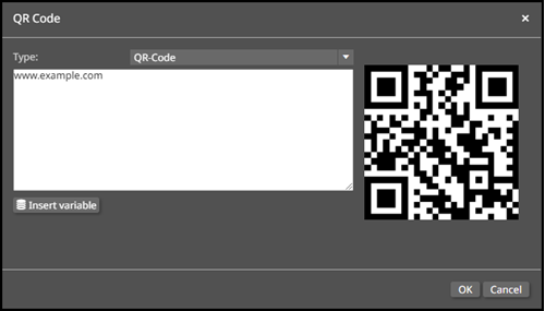
● For the QR-Code type, you must enter a URL to which the QR Code will redirect.
● The remaining Types are more accurately described as barcodes where you must enter a series of digits, numbers, or symbols that follow the barcodes' guidelines. These include:
● Code39
● Code128
● Mailmark
● IT-Frankling-DeutschePost
● UspsIntelligentMail
● DataMatrix
● Interleaved2of5
● Ean13
● Ean8
● UPC-A
By default, all barcodes use data that contains CheckSum, which is important for data protection and file security.
3 Click OK.
4 Reposition the object on the page:
● Click anywhere on the object.
● Drag it to the desired place on the design template.
5 Resize and reposition the object wherever you like within the object frame.
● Resize:
● Click
 to increase the size of the object within the frame.
● Click
 to decrease the size of the object within the frame.
● Reposition:
● Click
the light-gray outer band of the image selector and then drag to reposition
the frame.

● Click
the dark-gray inner band of the image selector and then drag to reposition
the image within the
frame.

To arrange, align, group, and distribute objects on the page, see To arrange, group, align, and distribute objects in this help topic.

 E.
Add and format objects (rectangles, ellipses, lines)
E.
Add and format objects (rectangles, ellipses, lines)To add a shape (rectangle, ellipse, or line)
1 Click the add rectangle, add ellipse, or add line icon on the toolbar.
2 Reposition the object on the page:
● Click anywhere on the object.
● Drag it to the desired place on the design template.
To arrange, align, group, and distribute objects on the page, see To arrange, group, align, and distribute objects in this help topic.
To specify the layout of an image or shape
Select the image or object and configure on the Layout tab on the Context Panel (at the left side of the designer window).
● Size & Position:
● X: Specify the horizontal position for the image in the design area.
● Y: Specify the vertical position for the image in the design area.
● W: Specify the width of the image.
● H: Specify the height of the image.
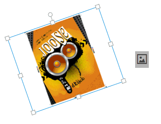
● Rotate: Specify
the angle of the image by entering a value (degrees from 0 to a maximum
of 360). A negative number will rotate the object counterclockwise
and a positive number will rotate it clockwise.
You can also rotate an object by clicking the rotate handle and then
dragging the box to the left or right till it reaches the angle you
want.
● Paddings: (For text and QR code objects) The padding is the space between the edge of the text frame and the text in the frame.
● Left: Enter or select a value for the left padding.
● Right: Enter or select a value for the right padding.
● Top: Enter or select a value for the top padding.
● Bottom: Enter or select a value for the bottom padding.
● Background:
Select a color for the background of the image frame (will fill the
part of the frame not covered by the image) and click OK.
For example, in the image below the background is set to gray.
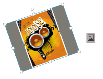
To delete a background color,
select the color in the list and click  .
.
To copy a color, select the color and click  (then
you can edit it to create a new color).
To edit the values of an existing or new copied color, select the color
and click  .
.
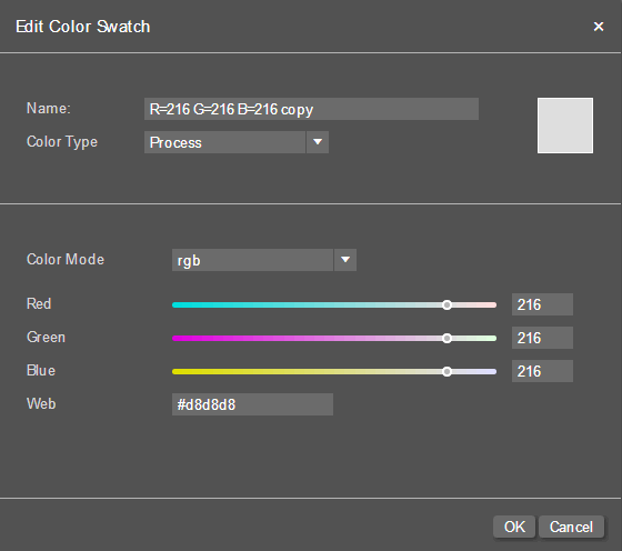
1. Name: Enter a name
for the color.
2. Color Type: Select
Process or Spot.
3. Color Mode: Select
rgb, cmyk,
or gray.
4. Enter or select values for the components of the selected
color mode (including the Web
value for RGB).
5. Click OK.
● Border: Defines the border if you want the object to have a border and the corner radius for the text frame.
● Color: Select a color for the border and then click OK.
● Border thickness: Enter or select a border width for the border.
● Corner
radius: Enter or select a corner radius if you want the image frame
to have rounded corners.
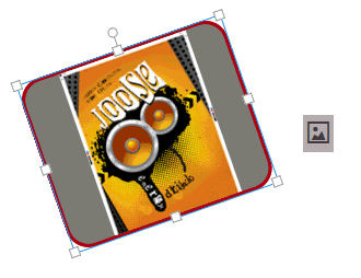
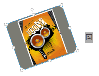
Note that the image frame can have rounded corners even if it does
not have a define border.
● Opacity: Sets transparency for the object.
100% is fully opaque; 0% is fully transparent.
● Blend Mode: Blend mode specifies how the color in the object interacts with objects behind (or below) it on the design when printed.
● Normal: (Default)
This mode prints the full value of the colors of the selected object.
The color object on top "knocks out" the color of the object
below.
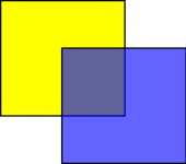
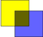
● Overprint: This mode causes the
colors to interacts because the color of the object on top does not
"knock out" the color of the object below but prints over
it (i.e., both colors are printed).
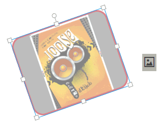
● Opacity: Enter a value or use the
slider to select one to set an opacity/transparency value for the
image. 100 represents 100% opaqueness, and 0% represents full transparency
(invisible). For example, the image below shows the opacity set at
50%.
To arrange, group, align, and distribute objects
● Arrange objects on the layer:
The settings described in this section arrange objects on the current layer. To work with layers, see Layers Manager in this help topic.
● To position the image on the current layer:
● Right-click the image.
● Select Arrange:
● Bring to Front: Moves the selected object to the top of the layer so that it appears on top of all other objects on the layer.
● Bring Forward: Moves the selected object toward the top of the layer so that it appears on top of objects beneath it on the layer.
● Send Backward: Moves the selected object toward the bottom of the layer so that it appears beneath objects above it on the layer.
● Sent to Back: Moves the selected object to the bottom of the layer so that it appears beneath all other objects on the layer.
● Group objects:
● SHIFT+click, CTRL+click, or use your mouse or pointer to draw a bounding box around two or more objects to combine them into a single object (group).
● Right-click and select Group (shortcut: CTRL+G).
You can then move the grouped
object and arrange, align, rotate, image fill, and distribute the
selected grouped object.
To ungroup objects: Right-click
the group object frame and select Ungroup
(shortcut Shift + Ctrl + G).
● Align objects relative to each other:
● Select two or more objects (using SHIFT+click, CTRL+click, or using your mouse or pointer to draw a bounding box around the objects to align).
● Right-click and select Alignment:
● Align bottom: Bottom aligns the selected objects to
each other or to each other and to the page (if Relative to
page is selected).
Before
alignment: |
After bottom alignment: |
After
bottom alignment (with Relative to page selected): |
● Align left: Left aligns the selected objects to each
other or to each other and to the page (if Relative to page
is selected).
Before
alignment: |
After left alignment: |
After
left alignment (with Relative to page selected): |
● Align center: Center aligns the selected objects to
each other or to each other and to the page (if Relative to
page is selected).
Before
alignment: |
After center alignment: |
After
center alignment (with Relative to page selected):
|
● Align right: Right aligns the selected objects to
each other or to each other and to the page (if Relative to
page is selected).
Before
alignment: |
After right alignment: |
After
right alignment (with Relative to page selected): |
● Distribute objects relative to each other: Distributing objects spaces them evenly across the page (horizontal distribution) or down the page (vertical distribution).
● Select two or more objects (using SHIFT+click, CTRL+click, or using your mouse or pointer to draw a bounding box around the objects to distribute).
● Right-click and select Relative to page.
● Right-click and select:
● Distribute horizontally: Spaces all selected objects down the page (from the top edge to the bottom edge).
● Distribute vertically: Spaces all selected objects across the page (from the left edge to the right edge).
Before distribution: |
After vertical distribution: |
After horizontal distribution: |
After vertical and horizontal
distribution: |

 F.
Specify what changes buyers can make to the template and design elements
F.
Specify what changes buyers can make to the template and design elementsThese settings determine what changes buyers can make to the template (e.g., alter size of the document, add elements such as text, images, QR codes, change colors, upload images, adjust the image resolution, etc.) when creating products.
1 Make sure no design element is selected.
2 Specify which options buyers can change on the Buyer Side tab in the Context Panel:
● Document
● Width
● Width
● Min: Specifies the minimum width buyers can set for the product
● Max: Specifies the maximum width buyers can set for the product
● Height
● Height
● Min: Specifies the minimum height buyers can set for the product
● Max: Specifies the maximum height buyers can set for the product
● Margin: Lets buyers adjust the margins
● Allow PDF Download: Lets buyers download a PDF preview version of the product
● Allow JPG Download: Lets buyers download a .jpg image file of the selected page of the PDF document
The resolution of downloaded JPG images will always have a width of 1024 pixels. The height varies depending on the aspect ratio of the document.
● Allow PNG Download: Lets buyers download a .png image file of the selected page of the PDF document
The resolution of downloaded PNG images will always have a width of 1024 pixels. The height varies depending on the aspect ratio of the document.
● Pages
● Bleed: Lets buyers adjust the bleed margins
● Show bleed button: Gives
buyers a bleed button  that allows them to show
/ hide bleed margins
● Thumbnails: Shows the page thumbnail panel for quick view and easy navigation through multiple-page products
● Add: Lets buyers add pages to the product
● Facing Pages: Displays interior left and right pages side-by side in the designer.
● Add Items: Select the check boxes to let buyers add the objects below when customizing their products.
● Image
● Text
● Headline
● QR-Code
● Rectangle
● Line
● Ellipse
● Colors
● Add: Lets buyers add custom colors to use in the product
● Edit: Lets buyers change colors used in the product
● Images
● Upload: Lets buyer upload their own images to use when customizing the product
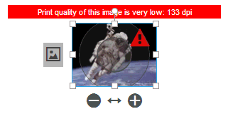
● Image Resolution
● Warning: Specifies the image resolution that will trigger an alert to buyers any time a buyer uploads an image file that has a resolution equal to or less than the specified value (e.g., "Print quality of this is image is low: 133 dpi").
● Error: Specifies the image resolution
that will trigger an error alert to buyers any time a buyer uploads
an image file that has a resolution equal to or less than the specified
value (e.g., "Print quality of this is image is very low: 63
dpi").
These settings determine what changes buyers can make to a selected design element in the template (e.g., reposition, rotate, resize, copy, etc.).
1 Select an element (text frame, image, QR code, or shape).
2 Specify which options buyers can change on the Buyer Side tab:
● General settings:
● Move: Lets buyers reposition the object.
● Resize: Lets buyers resize the object.
● Rotate: Lets buyers rotate the object.
● Remove: Lets buyers remove the object from the design.
● Keep Ratio: Locks the aspect ratio of the object so buyers cannot change it.
● Background Color: Lets buyers change the background color of the object.
● Copy: Lets buyers copy and paste the object.
● Drop Shadow: Lets buyers determine the drop shadow depth of the object.
● Opacity: Lets buyers determine the opacity of the object.
● Border:
● Border Color: Lets buyers change the object's border color.
● Border Thickness: Lets buyers change the thickness of the object's border.
● Corner Radius: Lets buyers change the corner radius of the object.
● Width:
● Min: Sets the minimum width of the object.
● Max: Sets the maximum width of the object.
● Height:
● Min: Sets the minimum height of the object.
● Max: Sets the maximum height of the object.
● Image:
● Change Image: Lets buyers replace the image with an image they upload or select from a gallery.
● Categories: Enter the names of the categories you want buyers to be able to choose images from if you want to limit their choices to specified image categories.
To specify multiple image categories,
separate the category names with a comma.
Note: You may need to
click File > Save
to set the changes before testing them on the Buyer side view.
● Text:
● Edit Text: Lets buyers change the text in the text object using either the text styles you have defined or rich text formatting options.
● Styles (for text elements only): Lets buyers apply the selected text styles to the text object.
If the Styles
checkbox is selected, buyers will have the option of selecting a style
or formatting the text with rich text options.
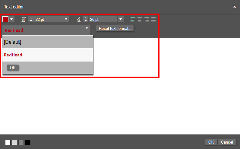
● You can specify which text formatting options you want to give buyers for text in the selected text frame:
● Styles: Select the styles listed that you want buyers to be able to choose to apply when formatting text in frame.
● Fonts: Select the fonts listed that you want buyers to be able to choose when formatting text in frame.
● Text Alignment
● Font Size
● Line Height
● Font Color
● Reset all text formats
● Text Flow
● Colors: Lets buyer change the color of the object (select all colors available to buyers).

 G.
Define a new paragraph style
G.
Define a new paragraph style1 Click
the add icon  to define a new paragraph style.
2 Select the style you added (by default
named new style or new
style copy ...) from the style list and then click the edit
icon  .
.
● On the Text Style Manager > Text Style page, define the text style:
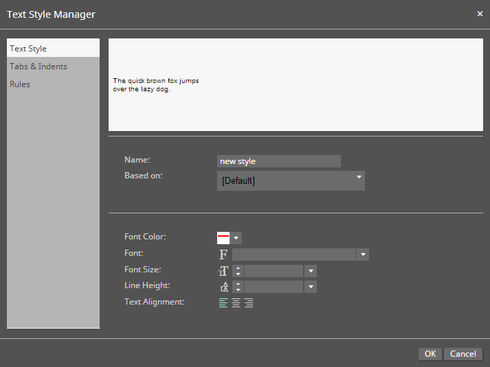
● Name: Enter a name for new style.
● Based on: Specify the style on which to base the new style.
● Font Color: Specify a color for the font.
● Font: Specify the font from available fonts in the template.
● Font Size: Specify a font size for the style.
● Line Height: Specify the line height for the style to control line spacing.
● Text Alignment: Specify the alignment for the style: left, center, or right.
● Letter Spacing: Specify the percentage by which to adjust the space between letters for all text set in this style.
The default letter spacing is 0. Selecting a negative number will decrease the space between letters. Selecting a positive number will increase the space between letters. The table below demonstrates how letter spacing affects sample text.
| Letter Spacing | Sample Text |
0 |
 |
50 |
 |
-50 |
 |
● On the Text Style Manager > Tabs & Indents page, define the alignment for the style:
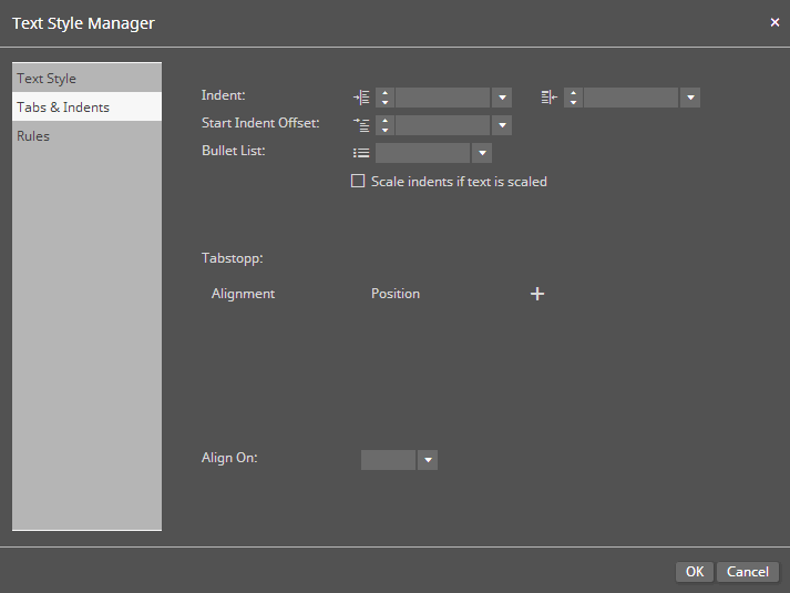
● Indent: Specify the indentation for the left and right sides of the text.
● Start Indent Offset: Specify the indentation for the first line in a paragraph.
● Bullet List: Specify a bullet symbol if the style is to be a bullet list.
● Scale indents if text is scaled: Select this check box if you want the values you specified for the indentation to scale when the text is scaled.
● Tab stop:
● To
add a tab stop, click the add icon  .
.
● Specify the Alignment: left, right, center, decimal.
● Specify the Position of the tab (i.e., the horizontal position for the tab stop).
To insert a tab when editing text in a text frame, simultaneously press \ (backspace) and t (lowercase letter t): \t
● Align On: Specifies whether to align the contents on commas (,) or decimal points (.).
● On the Text Style Manager > Rules page, define the rules (overlines and underlines) for the style:
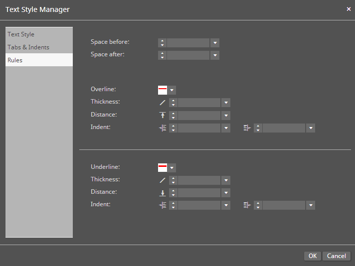
● Space before: Specify the space above the overlines and underlines.
● Space after: Specify the space below the overlines and underlines.
● Overline: Specify the color of the overline.
● Thickness: Specify the thickness of the overline.
● Distance: Specify the distance between the text and the overline.
● Indent: Specify the indentation for the left and right sides of the overline.
● Underline: Specify the color of the underline.
● Thickness: Specify the thickness of the underline.
● Distance: Specify the distance between the text and the underline.
● Indent: Specify the indentation for the left and right sides of the underline.

 H.
Working with data in design templates: Form Fields, Variables, and Switches
H.
Working with data in design templates: Form Fields, Variables, and SwitchesAdd form fields to a design template
Form fields are database fields in single record mode that are shown to buyers who are customizing the product as fields in a Web form.
1 Open the Data tab.
2 Click Create Form Field.
3 Click the edit form field  icon.
icon.
4 Configure the form field in the Form Field Editor.
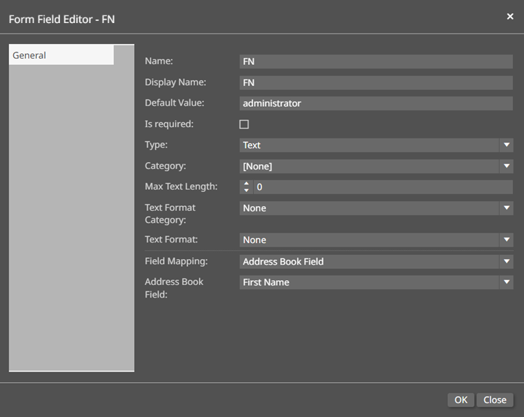
● Name: Enter a name for the form field.
The Name field cannot contain special characters; the Display Name field can contain special characters.
● Display Name: Enter a display name for the field that will be shown to buyers.
● Default Value: Enter a default value if, for instance, you want to give buyers guidance (e..g., "Enter your first name here").
● Is required: Select if you want to require buyers to enter a value for this field.
● Type: Specifies the type of form field.
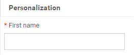
● Text: Designates the form field as a text field.
The field will be a text entry
box on the buyer side.
● Value List: Designates the form field as a list field.
The field will be a drop-down
list of values on the buyer side.

● Click List on the navigation bar to add values to the list.
You can either (a) create the key-value pairs in the list following the steps below or (b) import a list of key-value pairs in CSV format into the Form Field Editor by clicking the CSV-Import button, selecting the CSV file, and then clicking Open to import the file into SmartCanvas.
● Click
the add  icon.
icon.
You can add as many values to the list as you want.
● Add a Key and Display Value for each option.
For example, if you are adding
a Gender field with two options (Male and Female), you would define
two key-value pairs: Male and Female.

● To
move an option up or down in the drop-down list on the buyer side,
click the up  or down
  arrows.
● Click OK.
● Image: Designates the form field as an image field.
The field will be displayed as an image on the buyer side.
● To specify a default image, click the image icon on the form field in the Data tab.
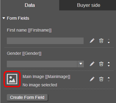
● On the Browse Images window, select an existing image or click Upload Images to upload a new image.
● Click OK.
● Color List: Designates the form field as a list of colors.
The field will be a drop-down list of colors on the buyer side.
● Click List on the navigation bar to add colors to the list.
You can either (a) create the key-value pairs in the list following the steps below or (b) import a list of key-value pairs in CSV format into the Form Field Editor by clicking the Colorlist-Import button, selecting the CSV file, and then clicking Open to import the file into SmartCanvas.
● Click
the add  icon.
icon.
You can add as many colors to the list as you want.
● Click the Color Swatch box to open the Edit Color Swatch window.
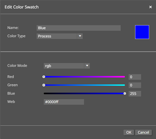
● Name: Enter the name of the color that will be visible to the buyer.
● Color Type: Choose the color type.
● Process colors use multiple inks blended together.
● Spot colors are solid colors created using premixed ink.
● Tint: Customize the tint of the Spot color using the Tint slider or entering a numerical value into the field.
● Color Mode: Choose the color mode.
● RGB: Customize the color using the Red, Green, and Blue sliders or entering a numerical value into each field.
You can also customize RGB
colors by entering the hex
value of a color into the Web
field.

● CMYK: Customize the color using the Cyan, Magenta, Yellow, and Black sliders or entering a numerical value into each field.
● Gray: Customize the color using the gray scale slider or entering a numerical value into the Gray field.
The default color is black.
The Key field
cannot be edited for the Color
List values. It will contain
the Name,
Color Mode,
and numerical values of the Color
Mode found in the Edit Color
Swatch window.
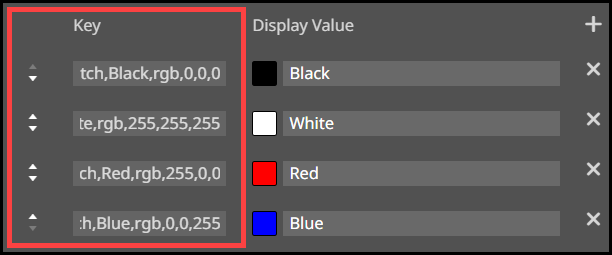
● Enter a Display Value for the color that will be visible to the buyer.
● To
move an option up or down in the drop-down list on the buyer side,
click the up  or down
  arrows.
● Click OK.
● Image List: Designates the form field as a list of images.
The field will be a drop-down list of images on the buyer side.
● Click List on the navigation bar to add images to the list.
You can either (a) create the key-value pairs in the list following the steps below or (b) import a list of key-value pairs in CSV format into the Form Field Editor by clicking the CSV-Import button, selecting the CSV file, and then clicking Open to import the file into SmartCanvas.
● Click
the add  icon.
icon.
You can add as many values to the list as you want.
● To add an image:
● Enter the file name of an image available in the image gallery into the Key field.
The Key value must exactly match the file name.
● Click the image thumbnail to open the Browse Images window and select an existing image or click Upload Images to add a new image.
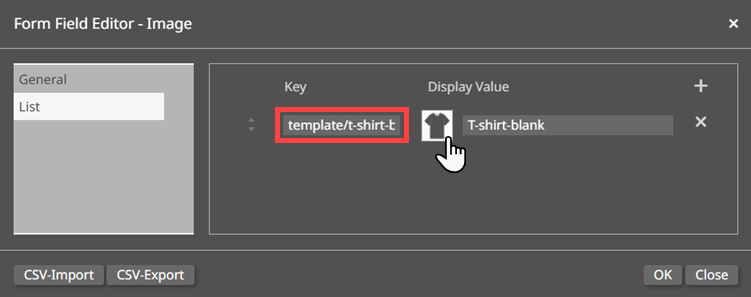
● Enter a Display Value for the image that will be visible to the buyer.
● To
move an option up or down in the drop-down list on the buyer side,
click the up  or down
  arrows.
● Click OK.
To delete a form field, click
the delete  icon for the form field.
● Target Swatch Color: Choose the target color of the Color List. If the Font Color or Background color of a shape is configured to the Target Swatch Color, then the color of the font and/or shape will change when the buyer selects a new color from the Color List.
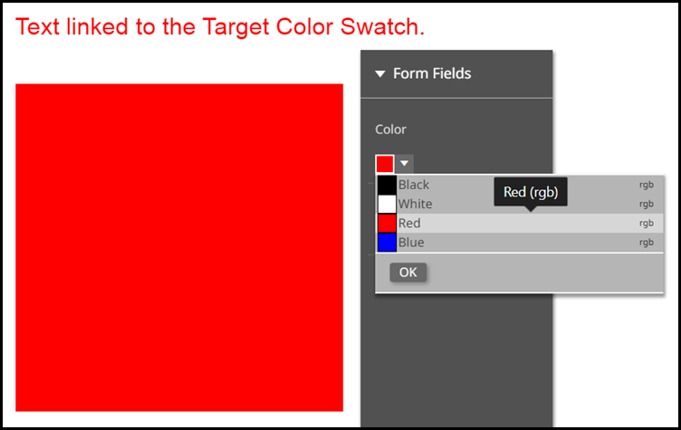
The Target Swatch Color option is only applicable to the Color List form field type.
The
Target Swatch Color must be a new color added the available
list of SmartCanvas template colors.
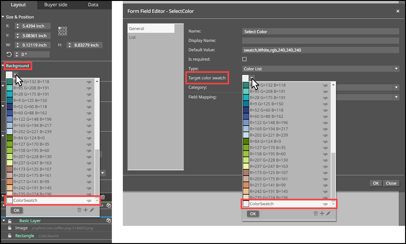
● Category: Associates the form field with a pre-defined category.
● Max Text Length: Specifies a maximum character length for a Text form field.
● Text Format Category: Choose a format category for the text. This selection will determine the options available in the Text Format option.
● Text Format: Choose the format for the text.
The Text Format Category, Text Format, and other text related fields that may appear depending on your choices for the previously mentioned fields are only applicable to the Text and Value List form field types.
● Field Mapping: Specifies the data source to which the form field is mapping (e.g., an address book field or user profile field).
● User Profile Field: Specifies the field in the MarketDirect StoreFront User Profile with which the form field is associated.
● Address Book Field: Specifies the field in the MarketDirect StoreFront Address Book with which the form field is associated.
● Data Source: Specifies the Single Column Data Source in MarketDirect StoreFront with which the form field is associated.
The Data Source option is only applicable to the Value List form field type.
5 Click OK.
6 You can associate a form field with any text element on the design template by right-clicking in a text frame.
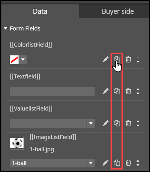
Form Fields
can be duplicated in the
Data tab
by clicking the Duplicate
icon (![]() ).
).
Variables (covered below) can be added
to any text element as well. Note that form fields are marked with
this icon:  . Variable fields are marked with this
icon:
  .
Note that variables, unlike form fields, will not be shown to buyers
in web forms.
To define variables for a design template
Variables let you set up business rules to govern how form field data is displayed.
1 Open the Data tab.
2 Click Add Variable.
3 Click the edit variable  icon.
icon.
4 Configure the variable on the Variable designer using if-then logic as demonstrated in the example below.
Here is an example of a dynamic rule for displaying form fields. Let's say you want to display the first name and last name whenever both names are provided but a salutation (Mr. or Ms.) and the last name when only the last name is provided.
Thus if a buyer enters values for both first name (i.e., Jost) and last name (i.e., Marco) in the form field, the name will be displayed as:

If, however, the buyer enters only a last name (i.e., Marco) in the form field, then the salutation and last name will be displayed as:

Here's how you would set up a variable to enforce that rule:
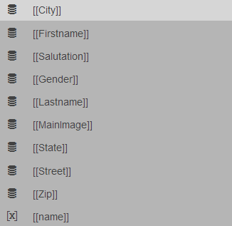
This example assumes that you have at least three form fields set up: [[Firstname]], [[Lastname]], and [[Salutation]].
1 Add a variable called, for example, name.
2 Click the edit variable icon.
3 On the Variable designer:
● Click
the blank variable box  .
.
● Select [[Firstname]] from the data or text list.
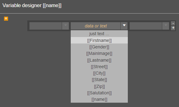
● Click
the add  icon to add another field to use in
the rule.
● Click
the newly added blank variable box  .
.
● Select [[Lastname]] from the data or text list.
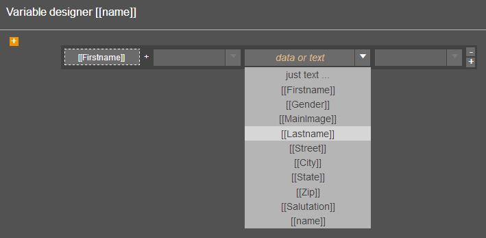
The prefix and suffix field have
characters (linebreak, tab, or space) that will appear only if there
is a value for the Lastname form field. That is, if the buyer does
not enter a value for the Lastname field, the selected prefix and
suffix values will not be applied.

This is very useful for dynamic text display. For instance, you can
use this to define a space between the Firstname and Lastname only
if both form fields have values (data). Click the [[Firstname]] and
select space {" "}
in both the prefix and suffix fields.

4 Click the add if block  icon.
icon.
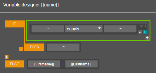
● To set a rule that says "if First Name form field is blank, add a Salutation and the Last Name separated by a space":
● In the IF section:
● Click
the first blank variable box  .
.
● Select [[Firstname]] from the data or text list.
● Leave
the second variable box  blank.
● In the THEN section:
● Select [[Salutation]] from the data or text list.
● Select space {" "} in the suffix field.
● Click
the add if block  icon.
icon.
● Click
the new blank variable box  .
.
● Select [[Lastname]] from the data or text list.
● The rule should look like this:

5 Click OK.
To delete a variable, click the delete  icon for the variable.
Variables can be duplicated in the Data tab
by clicking the Duplicate
icon (![]() ).
).
To define functions for a design template
Functions let you set up business rules to govern how variable or form field data is displayed.
1 Open the Data tab.
2 Click Add Variable.
3 Click
the edit variable ![]() icon.
icon.
4 Click inside the Variable field.

5 Click the Function
![]() icon.
icon.
6 Select a function from the Choose and edit a xFunction drop-down list.
● 
 Common
functions with examples.
First Part (input, splitter)
Gives the first part of a value (left side) up to a certain character
(splitter) in the value. You determine the character.
Example: firstPart(‘your.name@email.com’, ‘@’) --> ‘your.name’
Last Part (input, splitter)
Gives the last part of a value (right side) up to a certain character
(splitter) in the value. You determine the character.
Example: lastPart(‘your.name@email.com’, ‘@’) --> ‘email.com’
Left (input, length)
Only gives the first characters of a value from the left side.
You determine the number of places.
Example: left(‘0049 62 777 143’, 4) --> ‘0049’
Show the first four places from the left = 0049 = Country
Code (here: Germany)
Length (input)
Gives the number of characters of a value
Example: length([[FirstName]])
You could show a message like “Please enter a minimum of 5 characters.”
A typical message that checks how many characters are in a field.
Lower Case (input)
Gives a value in lower case letters
Example: lowerCase(‘Some TEXT’) --> ‘some text’
Remove (input, charsToRemove)
Deletes all of the specified characters from a text.
Example: Remove hyphens, spaces, and slashes from phone numbers.
Replace (input, replace, newValue)
Replaces a searched character with a new character. Typical find
and replace method with the difference that you are also able
to use variable content.
Example: your.name@email.com(email.com)(newemail.com) -->
your.name@newemail.com
Replace Curly Brackets (input)
Replaces all curly brackets with square brackets.
Example: {your.name@email.com} --> [your.name@email.com].
Right (input, length)
Only give the first characters of a value from the right side.
You determine the number of places.
Example: right(‘some text’, 4) --> ‘text’
Trim Left Side (input, length)
Cuts the specified length from the left side of the string
Example: trimLeftSide(‘some text’, 5) --> ‘text’
Trim Right Side (input, length)
Cuts the specified length from the right side of the string
Example: trimRightSide(‘some text’, 5) --> ‘some’
Trim To Length (input, length)
Returns the text shortened to a certain length. (At least 6 characters,
because the middle of the the text will always be replaced with
the 4 characters ‘ . . ‘)
Example: trimToLength(“some very long text”, 12) -->
“some’..’text”
Content from a database column with varying lengths can be shortened
on the pURL preview (in order to, for example, have a uniform
table layout).
UpperCase (input)
Gives a value in upper case letters
Example: upperCase(“some text”) --> “SOME TEXT”
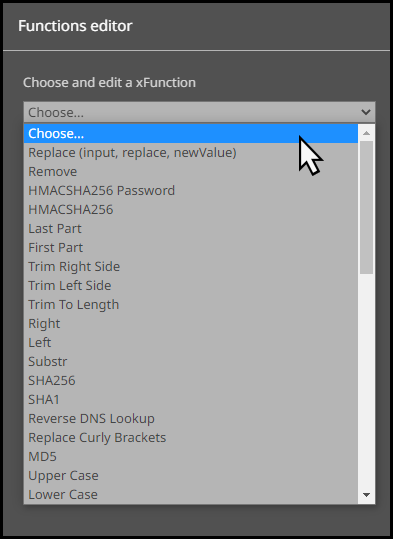
The Function Editor window provides tool-tips detailing
the purpose of the function, as well as each parameter of the function.
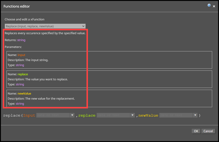
7 Complete the parameter field(s) of the function by entering a value or character(s) into the field, or choosing a Form Field or Variable from the drop-down list.
Notes:
-The Parameter drop-down
list will be auto-populated with existing Form Fields and Variables
from your database.
-If a parameter already contains a Form
Field or Variable and
you want to enter custom text, then select the just text ...
option.
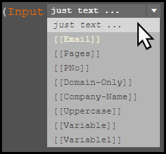
-Not all Functions contain
multiple parameters.
-The custom text can be alphabetic, numeric, or alphanumeric.
8 Click OK.
Here is an example of a dynamic rule for using functions. Let's say you want to take the company email address of a customer and only show the company name. To do this, you need to remove the username, the @ symbol, the dot, and the domain.
To create the function
1 Add a Form Field for an email address.
2 Add a Variable to remove the username and @ symbol from the email address.
● Click Add Variable.
● Enter a name for the Variable, such as Domain-Only.
● Click the Edit Variable icon.

● Click the Function icon in the Variable designer window.
● Select Last Part from the Choose and edit a xFunction drop-down list.
● Choose Email from the input drop-down list.
● Enter the @ symbol into the Splitter field.
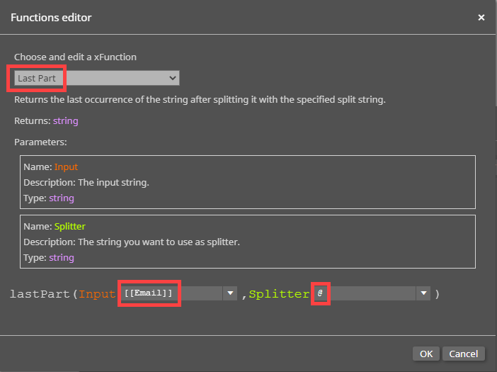
● Click OK.
● The
Domain-Only function
will return the domain name and the domain. For example, if
the email is john.smith@acme.com, then the Domain-Only function
will return acme.com.
3 Add another Variable to remove the domain from the email address.
● Click Add Variable.
● Enter a name for the Variable, such as Company-Name.
● Click the Edit Variable icon.
● Click the Function icon in the Variable designer window.
● Select First Part from the Choose and edit a xFunction drop-down list.
● Choose Domain-Only from the input drop-down list.
Functions
cannot be nested within each other. Multiple Functions must
be created in order for a one Function to interact with another.
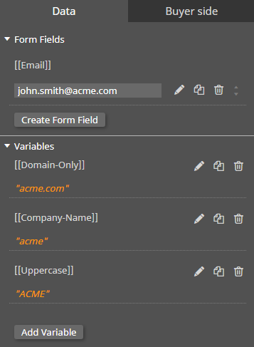
● Enter the dot character into the Splitter field.
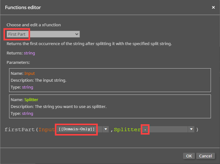
● Click OK.
● The Company-Name function will only return the domain name. For example, if the email is john.smith@acme.com, then the Company-Only function will return acme.
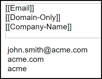
To delete a function, click the delete  icon for the variable.
Functions can be duplicated in the Data tab
by clicking the Duplicate
icon (![]() ).
).
Switches enable you to turn the visibility of layers on an off based on business rules you define.
To define switches for a design template
Switches are similar to form fields except the former do not appear in Web forms on the buyer side.
1 Open the Data tab.
2 Click Add Switch.
3 Click the edit switch  icon.
icon.
4 Configure the switch on the Switch designer.
Switches can be duplicated in the Data tab
by clicking the Duplicate
icon (![]() ).
).
Let's say you want to present a coupon for product 1 for customers who indicate a preference for product 1 and coupon 2 for customers who indicate a preference for product 2.
1 On
the Layers section of the Context Panel, click the add new layer  icon.
icon.
2 Double-click the "New Layer" name and type a name for the layer (e.g., Coupon 1 - Classic).

3 Create coupon 1 (e.g., the text, image, etc.) on the layer.

4 Click the layer visibility  icon and select Show
always.
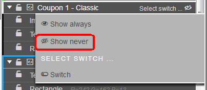
5 Double-click the "New Layer" name and type a name for the layer (e.g., Coupon 2 - Plus).

6 Create coupon 2 (e.g., the text, image, etc.) on the layer.

7 Create a form field for product preference (e.g., Favorite Drink?) with a value list with two options (e.g., Classic and Plus).
8 To automate display of the coupons based on preference, in the Data tab, click Add Switch.

9 Click the edit switch  icon.
icon.
10 On the Switch designer, click in the "Apples" form field selector and select "FavoriteJooseDrink."
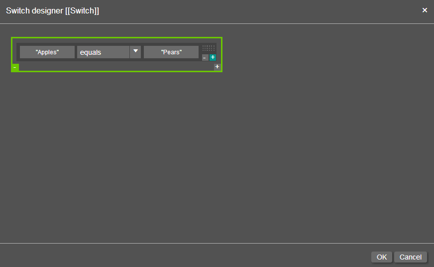
11 Click in the "Pears" form field selector and enter Classic.
12 Click OK.
13 Click the name of the switch and enter a new descriptive name for it: Classic.
14 Click Add Switch.

15 Click the edit switch  icon.
icon.
16 On the Switch designer, click in the "Apples" form field selector and select "FavoriteJooseDrink."
17 Click in the "Pears" form field selector and enter Plus.
18 Click OK.
19 When the Favorite Joose Drink form field
is set to Classic, the Classic switch is automatically turned on:
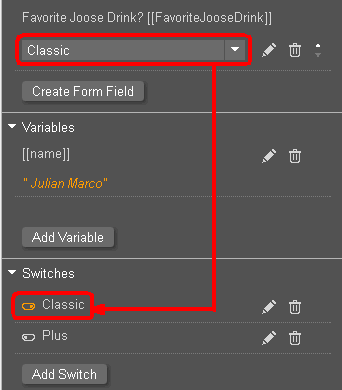
When the Favorite Joose Drink form field is set to Plus, the Plus switch
is automatically turned on:
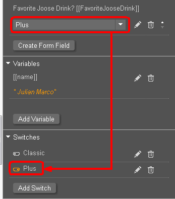
20 Click the name of the switch and enter a new descriptive name for it: Plus.
21 Now associate the switches with the layers.
● Go to the Coupon 1 - Classic layer, click Select switch..., and select Classic.
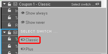
● Go to the Coupon 2 - Plus layer, click Select switch..., and select Plus.
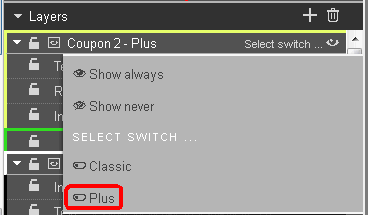
22 The appropriate coupon (layer) will be shown based on the value in the drink preference form field.

 Step
5: Set Security for SmartCanvas Templates
Step
5: Set Security for SmartCanvas TemplatesDesign Template Security lets you assign ownership and access rights for the design template. You can assign an owner for the design template and set permissions to restrict access to the template. This lets you make the template available to one user group but not to another.
1 Go to Administration > Manage SmartCanvas Templates.
2 On the Manage SmartCanvas Templates page, click the checkbox to the left of the template you want to secure.
3 Click the security  icon to open the Modify Security For Template... page.

4 Template Owner: By default the administrator is the owner (manager) of the template. To change the owner:
● Click Change to add or change who can manage the template.
● On the Select Owner window:
● In the first drop-down select the category of user to assign ownership of the template to: Users, Groups, Companies, or Departments.
● The
search field (  ) will help
you locate the group or user you are looking for, and the Show
field will limit the number of items displayed.
● Click the group, user, company, or department to assign ownership to.
5 Set Access Permissions: To specify who can use, edit, and manage the design template:
● Click Add User, Group, Company, or Department.
● On the Select Security Principal for which to Assign Permissions dialog:
● In the first drop-down select the category of user to whom to assign access to the template: Built-in Groups, Users, Groups, Companies, or Departments.
● The
search (  ) field will
help you locate the group or user you are looking for, and the Show field will limit the number
of items displayed.
● Click the group, user, company, or department to assign access to. The selected user, group, or company will be listed in the Access Permissions table. You can grant users the right to Use the design template (i.e., create products based on the ticket template), Edit the design template (i.e., modify the design), and/or Manage Template Security for the ticket template (i.e., change the security settings).
You can retract access permissions at any time by clicking Remove for the user, group, company, or department in the Access Permissions table.
● Click the Check Permissions For... and select the user, group, company, or department whose permissions you want to check. A new dialog will display the permissions for the selected entity.
6 Click Save.
For information on sharing products with entities, see Managing Entities.

 Step
6: Manage Template Settings
Step
6: Manage Template SettingsYou can update various global settings for the design template from the Manage SmartCanvas Templates page.
1 After saving your design template, go to Administration > Manage SmartCanvas Templates.
2 On the Manage SmartCanvas Templates page,
locate the template to update on the table and then click the template
settings icon to open the Update Template Settings...
window.
3 Specify the template settings:
● Template Name: (Read-only field)
● Description: Modify the description as needed.
● Allow watermarked PDF download: Select this check-box to allow buyers to download a preview PDF of the design.
● Force buyers to use latest template: Select this check-box to ensure buyers will have to use the latest version of the SmartCanvas template.
If the check-box is selected, then the buyer will have to use the new template, which will still contain their uploaded images to the gallery, but all other customizations will be erased or overwritten by the new edits. If the check-box is not selected, then the buyer will have the option to choose from either the new template or the original template. The new template will contain buyer uploaded images to the gallery, but all other edits will be erased or overwritten, whereas the original template will retain all of the buyer’s previous template customizations. The Force buyer to use latest template check-box is selected by default.
● Select
Gallery: Select which image
galleries to make them available to buyers when building products
based on the design template.
Available galleries are listed in
the box on the left; galleries in use for the template are listed
in the box on the right.
● Use
the add  icon
to move selected galleries into the template.
● Use
the remove  icon
to move selected galleries out of the template.
4 Click Update Template to apply your settings to the template.

 Step
7: Create and Publish a Product Based on a SmartCanvas Design Template
Step
7: Create and Publish a Product Based on a SmartCanvas Design TemplateTo ensure that the product is displayed properly in the visual product builder on the SmartStore storefront, be sure that all style sheet changes are merged for any customized SmartStore storefronts before publishing the product to the storefront. For more information on merging style sheet changes, see Compare and Merge Changes.
After you create a design template, you will need to associate it with a product and publish the product to make it available to buyers on your storefront.
1 Go to Administration > Products after saving your design template.
2 Click Create Product on the Manage Products page to open the Create Product window.

3 Enter a name for the product in the Name field.
4 Enter a name to display to the customer in the Display As field.
5 Choose SmartCanvas from the Product Type drop-down list.
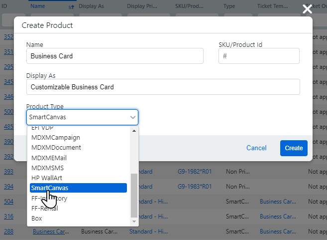
The SKU/Product Id field is optional.
6 Click Create.
7 On the Product Information pages, define the product as you would any other product on the Details, Settings, Pricing, and Security tabs with the following exceptions:
● On the Settings tab:
● Record Entry Mode:
● Single—This option is for SmartCanvas products that use a single record (e.g., a single buyer's business card).
If you select both Batch Mode and Single Mode this is a hybrid mode for SmartCanvas that enables buyers to order the product either as a single job or a batch job. Single mode will be the default on the buyer side, but buyers can select batch. Buyers will be prompted to upload a CSV file. The file’s records are viewable and a preview document (showing the user’s personalized data on the document) can be generated to spot check each record’s content. This is useful for preventing printing a job that has formatting issues, such as a name too long for the allotted space.
● Batch—This option will prompt buyers to upload a multiple record data file (in comma separated value, CSV, format) or to use multi-column data sets (pre- created in the system; for more information, see Multi-Column Data Sets). For instance, batch would be used if a customer wanted to order business cards for all members of a department.
Notes
on Batch Mode: Buyers will be prompted to upload a CSV file
with multiple records for their SmartCanvas product on the storefront.
MarketDirect StoreFront will create a sample CSV file for the template
that you can use to format the CSV you use to port data to the system.
A “Sample.csv” file link will appear. Buyers will be able to open
the document in a text editor such as NotePad or WordPad and save
it with a name of their choice. This sample document, created on the
fly, serves to show users what data and in what format it is needed
for the selected variable template.
Note that the first line is the header line and is mandatory, meaning
it must be the first line in the CSV file because it establishes the
format for the table. An hourglass icon will indicate that the operation
is in process. An exclamation point icon will indicate any errors
that occurred during the mapping process.
ePS VDP Templates Products: Combo
Mode
A batch SmartCanvas product in MarketDirect StoreFront
can have both common (single) and versioned (batch) data. The term
"combo" (combination) refers to a mix of common and versioned
data in a SmartCanvas job. For example, a batch of postcards that
a realtor distributes can combine common elements (all the postcards
have the realtor's photo and address or a photo a property for sale;
same for all records) and versioned elements (recipient customers'
names and addresses; unique for all records). The buyer experience
has the buyer entering the common information into form fields (i.e.,
the web form) and assigning a data source for the versioned information.
IMPORTANT Please note that it may take 10 minutes or so for the MarketDirect server to generate the SmartCanvas artwork and make it available for processing via the job ticket. The length of time will be based on a number of factors, including the record count, complexity of the template (number of variables and rules), use of image personalizations, number of jobs awaiting artwork generation, etc.
● Direct Mail Jobs:
● Support Direct Mail: Select this option to enable buyers to order a direct mail campaign featuring the personalized product. Buyers will be presented with options for procuring and maintaining a mailing list with the mailing service providers you have set up on the Mailing Service Providers page.
● Support EDDM: Select this option if you want to support Every Door Direct Mail (EDDM) services for the product mailings.
For information on EDDM, visit https://www.usps.com/business/every-door-direct-mail.htm.
● Support List Purchase: Select this option if you want buyers to be able to purchase a mailing list for the product.
AccuZIP mailing lists contain
an extensive array of data on mail recipients. See the List Codes (PDF)
for a comprehensive list of all available data. See the SampleOutput (CSV) for a sample output file.
For more information on setting up and managing mailing service
providers such as AccuZIP, see the topic Mailing
Service Providers.
IMPORTANT The direct mail automation workflow is optimized for 50,000 records or fewer.
● Allow Opt-Out of Direct Mail: Check this box to give buyers the option of not using a direct mail provider to provide mailing service (e.g., bulk mail) to recipients (and instead have all copies shipped to the buyer who will then handle mailing and distribution to recipients).
● Override mailing service class: Select this option if you want to allow buyers to override the default mailing service class for the product.

● FIRST CLASS: Select this option if you want to allow the buyer to choose First Class for the product.
● STANDARD MAIL: Select this option if you want to force the buyer to choose Standard Mail for the product.
● Default Mailing Service Class: Select the default mailing service class for the product.
You will probably want to allow buyers to override mailing service class only if the default mailing service class is Standard; buyers would thus be able to upgrade from Standard to First Class for better service at a higher cost. If the mailing service class is First Class, allowing buyers to override with Standard would result in lower cost but slower service, which would be a downgrade.
● Sample VDP Data: Check this box to show default sample data settings (in the default file you will upload below) to the buyer.
● Default File: Click Browse... and select a file (in csv format) with sample data to populate the template and then click Upload.
● Default Encoding: From the pull-down list, select the default encoding for the data: Western European (Windows), Unicode UTF-8, or Unicode.
● Default Delimiter: From the pull-down list, select the default delimiter for the data: ,, I, Tab, ;.
● Use MCD: Enabled: Select this option to enable multi-column data sets with this template and to let the company address book be available for buyers to map fields to.
How buyers will use multi-column data sets: Buyers can also use an MCD along with an uploaded CSV data file. The buyer can select the Select Data & Create Data Source option then choose which records in the MCD should be used in the VDP job.
For more information on multi-column data sets (MCDs), see Data Sources.
● Show Address Book: Select this option to expose the address book so users can map address book fields to fields in the SmartCanvas template.
● Enable Low Resolution PDF: Select this option if you want to let buyers download a low resolution PDF.
● Preview DPI: Select a resolution (in DPI) for SmartCanvas product preview.
● N-Up—N-up stands for Number of pages up (2-up, 3-up, 4-up, etc.) printing. N-up printing is printing multiple buyer-submitted pages onto a single physical sheet and then cutting them to a specified finished size. For example, instead of using letter paper (8 1/2 by 11-inch paper), a job can be printed with a left-side page and a right-side page on tabloid (11 by 17-inch paper) and then cut down the middle with an industrial paper cutter.
Important: The N-up and brochure imposition settings set in SmartCanvas are used only to define the production PDF for the product. For pricing purposes, configure the N-up settings to be consistent with the imposition you defined for the design template in the SmartCanvas designer.
N-up printing accommodates your production processes that print multiple pages on a single sheet then cut to final size (the “cut and stack” model). The savings can thus be passed on to the buyer as the MarketDirect StoreFront pricing engine will take into account the number of sheets and impressions involved in printing N-up. For example, say a buyer orders 400 copies of a 16-page document. Without N-up, the pricing would be calculated on 400 x 16 = 6,400 impressions and 400 x 16 (simplex sheets per job) = 6,400 sheets. But if the product is set up for 2-up printing, only 3,200 impressions and 3,200 sheets are used (i.e., the number of sheets and impressions is halved). The model indirectly correlates the product cost to your cost of production with N-up capabilities (e.g., where lower impression cost is passed on to the buyer).
N-up should only be used for products that are very well-defined, i.e., those that have only one choice of Media size and a known finished size.
● Enabled: Check the box to activate N-up printing for the product (catalog item).
● Type: Select an option:
● Booklet (2-up across, duplex): A Booklet is a multi-page document with a wraparound cover that is typically printed 2 pages-up per side, folded in half, and saddle-stitched. An N-Up job is typically a document printed with two or more pages per side, cut, and stacked.
Warning:
Ticket Template Requirements for
Booklet Products: "Rules for Booklets"
For a booklet product to work properly, the ticket template on which
it is based must meet very specific conditions.
1. The ticket template cannot
contain special pages.
2. The ticket template must
have duplex option selected.
No simplex.
3. All Media must be of the same physical size
(e.g., for an 8.5 x 11 booklet, the interior and cover Media would all need to be at
least 11 x 17; they could be 12 x 18 if, for example, the pages had
full bleeds and the final booklet product will be trimmed).
4. The ticket template cannot
use tabs/tabbed Media.
5. The ticket template must
be set up for a wraparound cover
if you want to give buyers the option of having a separate cover for
the booklet. Cannot have front
or back cover options, only
wraparound cover option.
● Step and Repeat (based on your specifications): A Step and Repeat imposition is used for printing multiple copies of the same page to fill a large sheet (typically with odd pages on the front and even pages on the back as with business cards).
● N-Up Preview Size: Select a size for the N-up preview from the list.
● Select the No check box in the Mobile Supported section.

Important: Support for use on small format mobile devices (e.g., cell phones) is not available at this time.
For complete information on creating and publishing a product, see Create Products.
8 On the SmartCanvas Web Form page:
● Click Associate SmartCanvas Template.
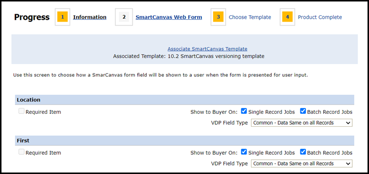
● Select the design template to associate with the product in the Associate SmartCanvas Template window.
● Click Assign Template. This will bring in all the fields defined in the selected template so you can map them with the web form buyers will complete when ordering the SmartCanvas product.
● Show to Buyer On:
● Check Single Record Jobs box to make the field visible to buyers ordering a single (one record) SmartCanvas product on the storefront.
● Check Batch Record Jobs box to make the field visible to buyers ordering a batch (multiple record) SmartCanvas product on the storefront and enable buyers to enter data into the editable field.
● VDP Field Type: Specify whether the field type is Versioned or Common.
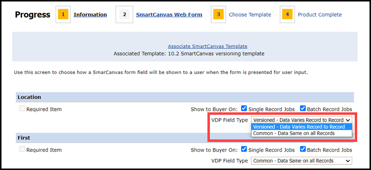
EFI
VDP Templates Combo Mode
A batch SmartCanvas product in MarketDirect StoreFront
can have both common (single) and versioned (batch) data. The term
"combo" (combination) refers to a mix of single and batch
data in a SmartCanvas job. For example, a batch of postcards that
a realtor distributes can combine common elements (all the postcards
have the realtor's photo and address or a photo a property for sale;
this is the single mode part) and versioned elements (recipient customers'
names and addresses; this is the batch part). The buyer experience
has the buyer entering the common/single information into form fields
(i.e., the web form) and assigning a data source for the versioned/batch
information.
● After mapping all fields on the form with fields on the selected template, click Next.
9 On the Choose Template page, select the ticket that suits the design template from the Ticket pull-down list.
10 Click Finish.
11 On the Product Complete page, click Publish It.
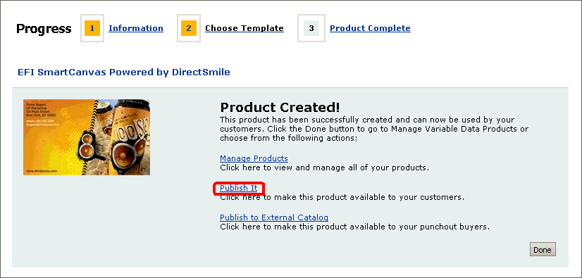
12 On the Select Target Category dialog, select the category in which to publish the new product and then click Publish.
13 Click Done.
14 Go to the storefront and navigate to the target category to verify that your new product is available.
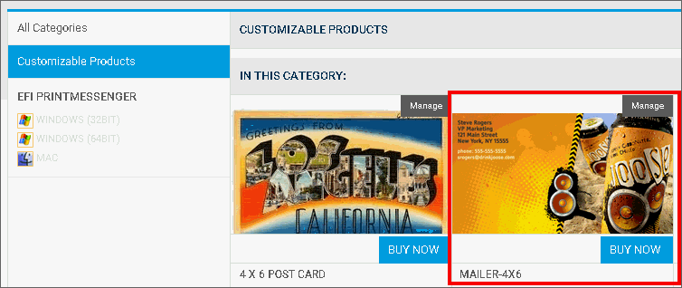

 Create
a SmartCanvas Design Template Based on an Existing Template
Create
a SmartCanvas Design Template Based on an Existing TemplateThere are two ways administrators can create a SmartCanvas design template based on a an existing template.
Copying an existing design template and then renaming it and modifying its specifications as needed is often more efficient than creating a design template from scratch. To create a design template from scratch, click Create New Design on the Manage SmartCanvas Templates page. Then follow the instructions in the Create a SmartCanvas product template.
1 On the Manage Design Templates page, click the radio button corresponding to the template that most closely resembles the design template you want to use as a starting point for the new design template you are creating.
The template designer will open with the design template you selected in the active window.
2 Click Copy.
3 In the Copy Template window:
● Enter a Template Name and Description.
● Click Copy Template.
You are now ready to begin modifying your design template. See the section Step 3: Design the SmartCanvas Design Template.
Exporting a SmartCanvas template allows administrators to import them into a different MarketDirect StoreFront account.
To Export a SmartCanvas Template:
1 On the Manage Design Templates page, open the SmartCanvas template you want to export.
2 Click File and select Export design.
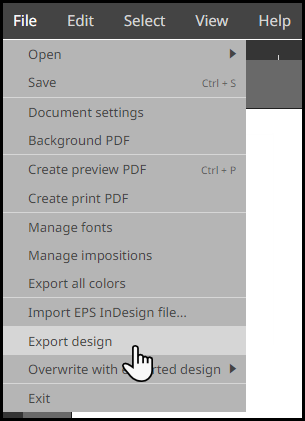
3 Copy the URL from the Please download the exported zip file pop-up window.
4 Paste the URL into a new browser window.
5 Choose a destination for the zip file and click Save.
The zip file
may automatically download to your Downloads
folder.
You can also import a SmartCanvas
template using the URL.
To Import a SmartCanvas Template:
1 On the Manage Design Templates page, open a SmartCanvas template.
The imported SmartCanvas template will overwrite the existing file, so it can either be blank or already populated with data.
2 Click File and hover on Overwrite with exported design.
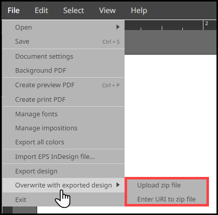
3 Choose Upload zip file to upload an exported SmartCanvas template zip file.
Select the SmartCanvas template zip file you want to import.
Click OK.
Reload the SmartCanvas template by closing then re-opening it.
4 Choose Enter URL to zip file to import a SmartCanvas template using the URL.
Enter the URL of the SmartCanvas template zip file into the pop-up window.
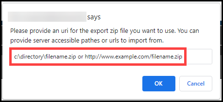
Click OK.
Reload the SmartCanvas template by closing then re-opening it.
● To view or change the ticket template associated with a product